
Bringing Out Shadow And Highlight Detail In An Image With Photoshop
In this Photoshop tutorial, we'll learn how to bring out hidden detail in the shadows and highlights of an image using Photoshop's aptly named Shadow/Highlight adjustment.
First introduced in Photoshop CS, the Shadow/Highlight command quickly became a favorite with photographers and photo retouchers for its amazing ability to bring out details in the shadow and highlight areas of an image that were simply too dark or too light to see. In fact, the Shadow/Highlight command proved to be so good at bringing out image detail, many Photoshop users began applying it to all of their images, even ones that at first glance didn't seem to need it.
The only real problem with the Shadow/Highlight command was that its default settings often made images look worse, not better, causing many people unsure of how the adjustment worked to quickly cancel out of it, never to return again.
Also by default, the Shadow/Highlight command gives us only two basic controls, much like the Brightness/Contrast adjustment we looked at previously. The real power of the Shadow/Highlight command is found in its advanced options which we'll be covering in this tutorial. We'll also look at how to save more useful default settings to give you a better starting point when applying the Shadow/Highlight command to future images.
I'll be using Photoshop CS4 for this tutorial, but older versions as far back as Photoshop CS will work just fine.
Here's a photo I snapped the other day of a duck enjoying a swim and a drink in a small pond. I didn't have the heart to tell him that his "small pond" was really just a large puddle since he seemed quite happy to have found it:
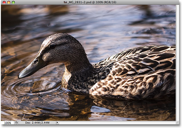
Unfortunately, the duck caught me by surprise and not wanting to miss the shot, I quickly aimed the camera and snapped the photo in a panic, forgetting to use a fill flash. The result was an image made up mainly of dark shadows and bright highlights with not much in between. Let's see if we can bring out more detail in the image, easing up a bit on the contrast and reducing its harsh appearance, using the Shadow/Highlight command. Before we begin, it's important to keep in mind that as powerful as Photoshop is, it can't restore detail that simply isn't there. If the shadow areas in your image are so dark they've become pure black, or if your highlight areas are so bright they've become pure white, there won't be any detail to restore. If there is detail though, the Shadow/Highlight command can work wonders.
While most of Photoshop's image adjustments are now available as adjustment layers, the Shadow/Highlight command isn't one of them. It's simply too complex to work as an adjustment layer, so it's only available as a standard image adjustment. Since standard image adjustments cause permanent changes to our images, we need to take steps to protect the original image from harm. You'll find the original image on the Background layer in the Layers palette. To protect it, we'll work on a copy of the Background layer, and the easiest way to create a copy of a layer is with the keyboard shortcut Ctrl+J (Win) / Command+J (Mac). You could also go up to the Layer menu, choose New, and then choose Layer via Copy, but the keyboard shortcut is faster. When you're done, you'll see a copy of the Background layer, which Photoshop automatically names "Layer 1", sitting above the original. Notice that the new layer is highlighted in blue which is Photoshop's way of telling us that the layer is selected and ready to go:

To access the Shadow/Highlight command, go up to the Image menu at the top of the screen, choose Adjustments, and then choose Shadow/Highlight from the list:

This brings up the Shadow/Highlight dialog box. If you haven't yet made any changes to the default settings, you'll see a very simple dialog box with only two sliders, one for brightening shadows and the other for darkening highlights. The default Shadows amount is 50%, while Highlights is set to 0%:

A Shadows value of 50% is usually too much to start with and can result in images looking washed out or, in some cases, even give them a strange, otherworldly appearance, which is why some people quickly cancel out of the command and shrug it off as useless. That's unfortunate since Shadow/Highlight can be incredibly useful if we make a simple change to the default settings, which is what we're going to do. We're going to set both the Shadows and Highlights options to a starting value of 0% and save them as the defaults so that the next time we go to apply the Shadow/Highlight command on an image, it will have no effect at all until we make our own adjustments.
Since the Highlights option is already set to 0%, all we need to do is change the Shadows amount. To do that, simply click on the slider for the Shadows option and drag it all the way to the left:

To save the values as the defaults, select Show More Options in the bottom left corner of the dialog box:

The dialog box will expand to show several additional options that give us greater control over our results. We'll look at these options in a moment, but for now, all we're doing is saving our changes as the new default settings. For that, the only option we need is the one near the very bottom of the dialog box that says Save As Defaults. Click on the button to select it:

The next time we open the Shadow/Highlight command, the dialog box will appear in this expanded view (which is what we want) and both the Shadows and Highlights values will be set to a starting value of 0%. Now that we've taken care of the default settings, let's look at how to actually use the Shadow/Highlight command.
The expanded version of the Shadow/Highlight dialog box may appear a little intimidating at first, especially since the simplified version of the dialog box contained only two sliders. If you look closely though, you'll see that it's divided into three sections, and two of the three sections are exactly the same. At the top is the Shadows section containing three sliders to help us bring out shadow detail in the image. Directly below it is the Highlights section which contains the exact same three sliders. These sliders allow us to bring out detail in the highlights and they function exactly the same as the sliders in the Shadows section, so once you understand how the Shadows section works, you'll already know how the Highlights section works! Below the Highlights section is the Adjustments section which contains a few additional options for adjusting the image. We'll look at the Adjustments sections a bit later. First, let's look at the three sliders that make up the Shadows section.
The first slider, Amount, is straightforward stuff. It controls the amount of brightening that you want to apply to the shadows. The further you drag the slider towards the right, the more shadow detail you'll recover. If you drag it too far, you'll brighten the shadows too much, but there's no need to worry about it since you can go back and fine-tune it later. Every photo is different, which means there is no specific value to use here, so keep an eye on your image in the document window as you drag the Amount slider and set it to whatever looks good for now. I'm going to set mine to around 40% to start with. The amount you decide on may be completely different depending on your image:

Simply by increasing the Amount value, I've brought out lots of detail in the shadow areas of the image. The photo is already looking much better:

Below the Amount setting is the Tonal Width slider, which determines the range of tonal values that will be affected by the adjustment. At its lowest setting, only the darkest areas of the image will be affected. As you drag the Tonal Width slider towards the right, you'll expand the range of affected tonal values to include more of the midtones. Again, there is no specific value to use, so you'll need to look at your image as you drag the Tonal Width slider to determine which setting works best for the photo you're working on. For me, a Tonal Width value of around 60% looks good:

Finally, the Radius slider determines how the adjusted areas of the image will blend in with the rest of the photo. If you set the Radius value too low, the image will appear flat and dull and you could also see harsh transition areas between the adjusted and unadjusted areas of the image. Generally, a higher Radius value works best, although again it depends on the photo so you'll want to look at the image while dragging the Radius slider to judge the correct setting. I'm going to drag my Radius slider to a value of around 70px:

Once you've set the Radius value, you'll most likely want to go back and fine-tune the Amount and Tonal Width settings until you determine the values that work best. It's not uncommon to go back and forth several times with the settings before you get them just right. I'm going to bump my Amount value up even further to around 60%. My original Tonal Width setting of 60% still works well:

I've settled on an Amount value of 60%, a Tonal Width value also of 60% and a Radius value of 70%. I think my photo now looks greatly improved with much brighter, more detailed and natural looking shadow areas:

We'll look at how to bring out detail in the highlights, as well as some additional options, next!
Many people use the Shadow/Highlight adjustment in Photoshop simply to bring out detail in the shadows, leaving the highlights alone. There's certainly nothing wrong with that, especially since our eyes are not nearly as good at distinguishing highlight detail as they are with shadow detail, so the Shadow/Highlight command seems to get most of its "wow factor" from the shadows. However, the Highlights section of the Shadow/Highlight dialog box, which you'll find directly below the Shadows section, is designed specifically to bring out any hidden details in the highlights of an image, and the best part is, you already know how to use it!
The Highlights section contains the exact same three sliders - Amount, Tonal Width and Radius - that we just looked at in the Shadows section, and they work exactly the same way. The Amount slider determines the amount of darkening you want to apply to the highlights. The further you drag the Amount slider towards the right, the more highlight detail you'll bring out. The Tonal Width slider determines the range of tonal values that will be affected. The only difference here is that it sets the range for the highlights, not the shadows. At its lowest setting, only the brightest areas of the image will be affected by the adjustment. As you drag the Tonal Width slider towards the right, you'll expand the tonal range to include more of the midtones. The Radius slider determines how the adjusted highlight areas will blend in with the rest of the image. Just as with the Radius slider in the Shadows section, setting the Radius value too low will cause the image to look flat. Again, there are no specific values to use for these options since the correct settings will depend entirely on the image you're working on, so keep an eye on your image in the document window as you move the sliders.
Generally, it's best to avoid making any major changes to the highlights since it could reduce overall image contrast, but minor changes can often help. After adjusting and then fine-tuning my Highlights sliders, I've settled on an Amount value of 10%, a Tonal Width value of 62% and a Radius value of 80px. Of course, your settings with your image will most likely be different:

Here's my image after darkening some of the highlights. The difference is subtle, but the water reflections are not quite as bright as before, lessening their impact and bringing more attention to the duck. Also, some minor detail has been restored in the brighter areas of the duck's feathers:

If you find after you've finished adjusting the shadows and highlights that your image has lost some of its original color saturation, you can give the saturation a boost using the Color Correction slider found in the third section of the Shadow/Highlight dialog box, Adjustments. I'm not sure why Adobe chose to call it the Color Correction option since it really is nothing more than a saturation slider, but if you need to increase color saturation, simply drag the slider towards the right, or drag it towards the left to lower the saturation amount. The default value of +20 is usually good enough, but I'll increase mine to +30 to make the colors a little more intense. Finally, the Midtone Contrast slider can be used to increase contrast in the midtone brightness values, giving the image a bit more "pop" if needed. I'm going to increase my Midtone Contrast value to around +20:

And with that, we're done! Here, after bringing out the shadow details and toning down some of the highlights, is my final result using nothing more than the Shadow/Highlight adjustment in Photoshop:

And there we have it! That's how to bring out shadow and highlight detail an image with the Shadows/Highlights tool in Photoshop! Check out our Photo Retouching section for more Photoshop image editing tutorials!