
The Improved Auto Levels Adjustment In Photoshop
In the previous tutorial in this series on tone and color correction in Photoshop, we learned the basics of how to improve the overall tonal range of an image using a Levels image adjustment. We learned how to darken the shadows by setting a new black point, how to brighten the highlights by setting a new white point, and how to brighten or darken the midtones using the midtone (or gamma) slider.
In this tutorial, we'll learn how to save time by taking advantage of the Auto button in the Levels dialog box, which lets Photoshop try to auto-correct the tonal range for us!
The Auto button was greatly improved back in Photoshop CS6. Prior to CS6, it worked just like the Auto Tone command found under the Image menu (which we looked at back in the Auto Tone, Auto Contrast and Auto Color tutorial). And just like the Auto Tone command, the result we got was fully automatic. We either liked the way the image looked afterwards, or more often that not, we didn't. And if we didn't, our only real option was to undo the Auto result and start all over again with our own manual Levels adjustment.
In Photoshop CS6, things changed. Adobe added a brand new algorithm to the Auto button known as Enhance Brightness and Contrast which looks at your image histogram and makes intelligent decisions about how its tonal range can be improved. Not only does this produce better results, but the result is no longer a "take it or leave it" situation. As we'll see in this tutorial, the Auto button can now serve as a great starting point for your Levels correction, one that you can then further enhance using the black point, white point and midtone sliders.
If you haven't yet read through the previous Levels Image Adjustment Essentials tutorial, I highly recommend you do so before you continue since this tutorial assumes you already understand the basics of how a Levels adjustment works.
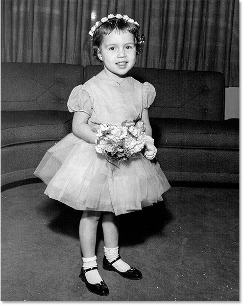
Here's the image I have open in Photoshop. As with the previous tutorial on Levels, I'm using a black and white photo here but everything we're covering applies to full color images as well:
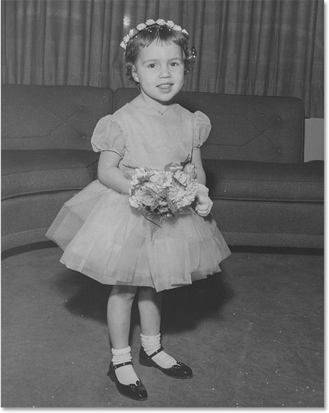
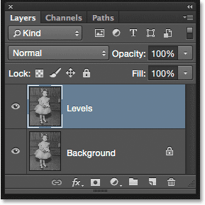
This image has faded a bit over time and could use a boost in contrast. Let's see how the Auto button in Levels can get things started for us. To save time, I've already gone ahead and duplicated my image so I have a separate copy to work on. If we look in my Layers panel, we see the original photo on the Background layer, and the copy is on a new layer which I've renamed "Levels" directly above it. Notice that the "Levels" layer is highlighted in blue which tells us it's the currently active layer:
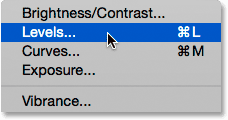
For this tutorial, I'll apply Levels as a static adjustment, which means it will be applied directly to the layer itself. To select Levels, I'll go up to the Image menu in the Menu Bar along the top of the screen, then I'll choose Adjustments, and then Levels:
This opens the Levels dialog box with the image histogram as the main feature in the middle:
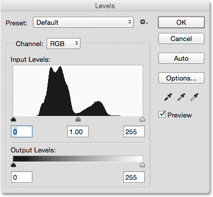
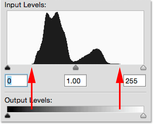
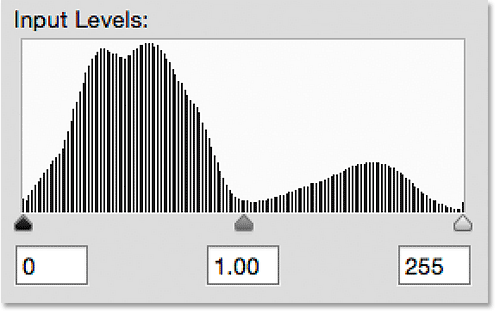
Let's take a closer look at the histogram to see what it's telling us about the current tonal range of the image. Here we see that, at the moment, we have no real shadow or highlight detail at all. If we compare the histogram with the black to white gradient bar running below it, we see that the left edge of the histogram, which represents the darkest pixels in the image, begins over a lighter than black shade of gray. The right side, which represents the brightest pixels in the image, begins over a darker than white shade of gray. In fact, the entire histogram is bunched up over the midtones in the middle. This explains why the photograph currents looks rather flat and lifeless:
The Auto Button
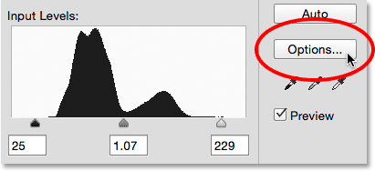
Fortunately, problems like this are an easy fix for Levels, but rather than jumping in and manually adjusting the black, white and midtone sliders, let's see what the Auto feature can do. I'll click on the Auto button which is located to the right of the histogram:
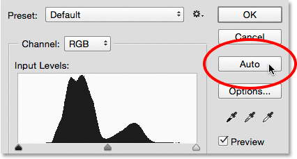
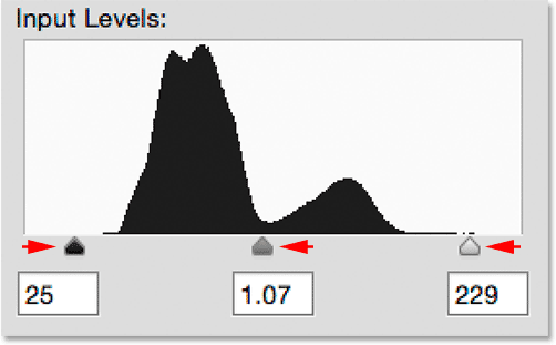
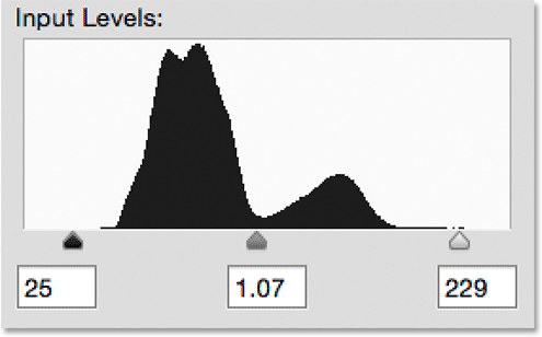
As soon as I click the Auto button, Photoshop analyzes the image, tries to figure out what improvements need to be made to the tonal range, and makes its own adjustments to the black point, white point and midtone sliders. Here, we see that Photoshop moved the black point slider towards the right, increasing it from 0 (the default value) up to level 25. This means that any pixels in the image that were originally at a brightness level of 25 or darker will now be pure black. On the other end of the histogram, Photoshop moved the white point slider towards the left, decreasing it from its default value of 255 down to level 229, which means any pixels that were originally at a brightness level of 229 or lighter will now be pure white. Finally, Photoshop brightened up the midtones a little by moving the midtone slider in the center towards the left, increasing its value from 1.00 (the default) to 1.07:
To compare the original version of the photo with the auto-corrected version, I'll uncheck the Preview option:
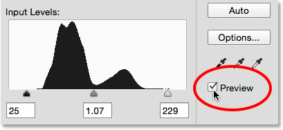
With Preview unchecked, we see the original version of the image:

I'll click inside the Preview checkbox to turn it back on, and here we see the auto-corrected version. Already things are looking better. With this image, the improvements are subtle, but they're definitely headed in the right direction:

The Auto Color Correction Options
Notice I said the improvements are "headed in the right direction", implying there's still more we can do. To understand the significance of that, let's compare this with how things used to work prior to Photoshop CS6. To do that, I'll click the Options button directly below the Auto button:
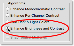
This opens the Auto Color Correction Options dialog box where we can choose from the various algorithms that are available to us for auto-correcting the image. I mentioned earlier that in Photoshop CS6, Adobe added a brand new algorithm known as Enhance Brightness and Contrast. It's selected for us by default, so as long as it's the one you want to use (which it pretty much always is) you won't actually need to click the Options button to select it:
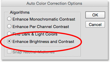
Prior to Photoshop CS6, only the first three algorithms in the list were available, and each one corresponds to one of the three Auto image adjustments found under Photoshop's Image menu. Selecting the first one, Enhance Monochromatic Contrast, would give you the exact same result as if you had applied the Auto Contrast command to the image. The second, Enhance Per Channel Contrast, would be the same as applying Auto Tone, and the third, Find Dark & Light Colors, would give you the same result as Auto Color.
The default algorithm prior to CS6 was the second one, Enhance Per Channel Contrast, so I'll select it to make it active:
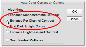
Switching between the different algorithms while the Auto Color Correction Options dialog box is open will instantly update the image with the new result, which makes it easy to compare them. Here's what the Enhance Per Channel Contrast option gives me. Notice that the contrast is now much more intense (even too intense), as opposed to the previous result which was more subtle. That's because the original three algorithms don't know how to do anything more than this. They mindlessly follow the same recipe for boosting contrast no matter what image you throw at them, and they do so on a channel-by-channel basis, meaning that, rather than looking at the image as a whole, each of the three color channels (Red, Green and Blue) that make up your image is treated separately (see the Auto Tone, Auto Contrast and Auto Color tutorial for more details). If this were a full color image, we would most likely see a shift in the colors as well:
With Enhance Per Channel Contrast still active, let's look again at the histogram in the Levels dialog box where the problems become more obvious. Notice that the tonal range of the image has been stretched to its limit, as if Photoshop said, "You want contrast? You got it!" The histogram now extends all the way from pure black on the far left to pure white on the far right. That may sound like an ideal result, but if we look closer, we see that it comes at a heavy price. Rather than appearing as a solid, continuous shape, the histogram now has a very definite comb pattern to it with lots of sections that are missing. Each missing section means we've completely lost image detail at that brightness level.
And, even worse, what happened to the black point, white point and midtone sliders? Remember how Photoshop had adjusted them for us? Well, now they've all been reset to their default values, which means I can't make any further adjustments of my own, at least not without clipping the shadows or highlights. If I find the result too intense (which I do), there's no way to fix it. This "take it or leave it" approach was how the Auto button in Levels worked prior to Photoshop CS6:
Let's jump ahead to the present by switching back to the new Enhance Brightness and Contrast algorithm:
And now, it's easier to see how much better the Auto button works today. Rather than just stretching the tonal range to extremes, Photoshop analyzes the contents of the image and makes intelligent decisions about how the tonal range should be adjusted. It then makes those adjustments using the actual black point, white point and midtone sliders:
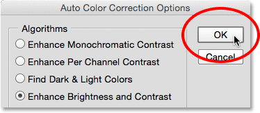
Since the adjustments were made with the sliders, I can easily improve on the initial auto-corrected result by simply dragging the sliders myself. Before I can do that, though, I'll need to close out of the Auto Color Correction Options dialog box by clicking the OK button:
Then, I'll increase contrast in the image even more by raising the black point value from 25 up to around 44, lowering the white point value from 229 down to 210, and darkening the midtones ever so slightly by lowering the value from 1.07 to 1.05:
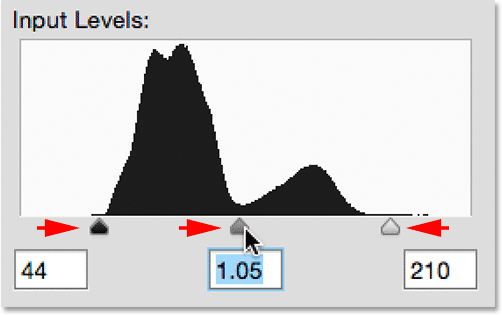
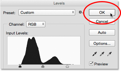
I'll click OK to accept the adjustments and close out of the Levels dialog box:
And here, after fine-tuning the initial auto correction, is my final result:

And there we have it! That's how to auto-correct and fine-tune the tonal range of your photos using a Levels image adjustment and the improved Auto button in Photoshop CS6 and CC (Creative Cloud)! Check out our Photo Retouching section for more Photoshop image editing tutorials!