Realistic Cast Shadow Effect In Photoshop
Photoshop's Drop Shadow layer style may be great for adding simple shadows to images or text, making them look as if they're floating slightly above their background, but when it comes to creating more realistic looking shadows of people or objects, the standard Drop Shadow just doesn't cut it. In this tutorial, we'll learn an easy way to create a realistic cast shadow effect!
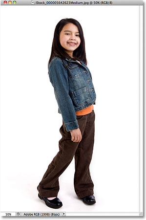
Here's the photo I'll be using for this tutorial:
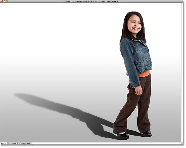
Here's how it will look with the shadow applied:

How To Create A Realistic Cast Shadow
Step 1: Select The Person Or Object
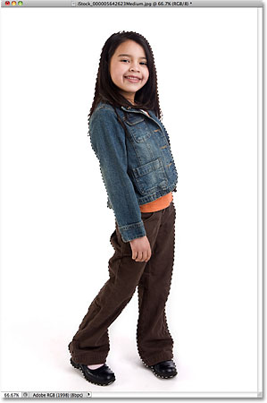
Before we can add a shadow to someone, we first need to select them. Using the selection tool of your choice (Lasso Tool, Quick Selection Tool, Pen Tool, etc.), draw a selection around the person (or object) in the photo. When you're done, you should see a selection outline around them. Here, I've selected the girl:
Step 2: Copy The Selection To A New Layer
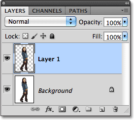
With the person or object selected, press Ctrl+J (Win) / Command+J (Mac) on your keyboard to quickly copy the selection to a new layer. Nothing will happen in the document window, but if we look in the Layers panel, we see that Photoshop has copied the selection to a new layer named "Layer 1" above the Background layer:
Step 3: Add Extra Canvas Space If Needed
Depending on your image, you may or may not need this step, but in my case, I need to add some extra canvas space to make room for the shadow. The easiest way to add extra canvas space is with Photoshop's Crop Tool. I'll select it from the Tools panel:

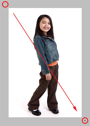
To make it easier to see what I'm doing, I'll switch out of the document window and into the first of Photoshop's fullscreen modes by pressing the letter F on my keyboard. Then, with the Crop Tool active, I'll click in the gray area above and to the left of the top left corner of the image, and with my mouse button held down, I'll drag to the gray area below and to the right of the bottom right corner:
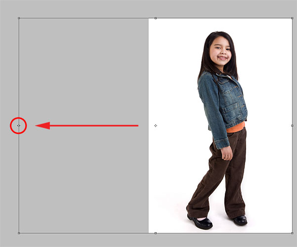
When I release my mouse button, a crop border appears around the image, with handles (little squares) on all four sides and in each corner. I need to add more canvas space on the left of the photo, so I'll click on the left handle and drag it outward:
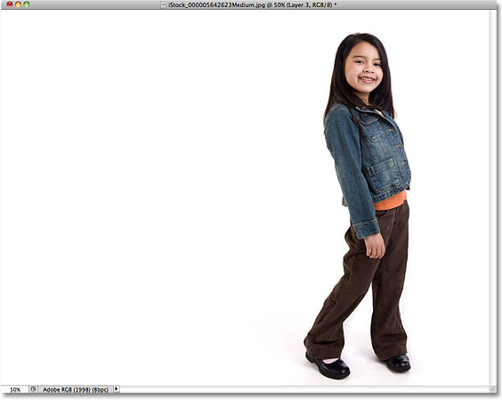
I'll press Enter (Win) / Return (Mac) to accept the crop (even though what we're doing here is really the exact opposite of cropping), at which point Photoshop adds the extra space on the left of the image and fills it with white (the default Background color). I'll press F on my keyboard a couple of times until I'm back to the document window view:
Step 4: Add A New Blank Layer Below Layer 1
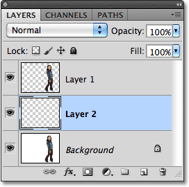
Hold down your Ctrl (Win) / Command (Mac) key and click on the New Layer icon at the bottom of the Layers panel:
This tells Photoshop not only to add a new layer to the document as it normally would, but to add the new layer below the currently selected layer (Layer 1), which places it between Layer 1 and the Background layer:
Step 5: Draw A Gradient On The New Layer
Let's create a new background for the effect using a gradient, which will give it a little depth. Click on the Foreground color swatch near the bottom of the Tools panel. By default, it should be showing black:

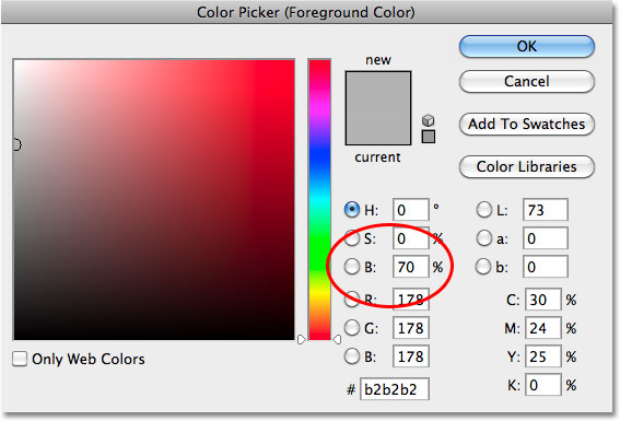
This opens Photoshop's Color Picker where we can choose a new Foreground color. Choose a light gray. If you want to use the same shade of gray that I'm using, enter 70% for the B value (B stands for Brightness) on the right. Click OK when you're done to close out of the Color Picker:
Next, select the Gradient Tool from the Tools panel. We'll be using the Gradient Tool a few times for this effect:

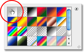
With the Gradient Tool active, right-click (Win) / Control-click (Mac) anywhere inside the document window to quickly bring up the Gradient Picker, and make sure you have the very first gradient - Foreground to Background - selected by clicking on its thumbnail (first one on the left, top row). Press Enter (Win) / Return (Mac) when you're done to close out of the Gradient Picker:
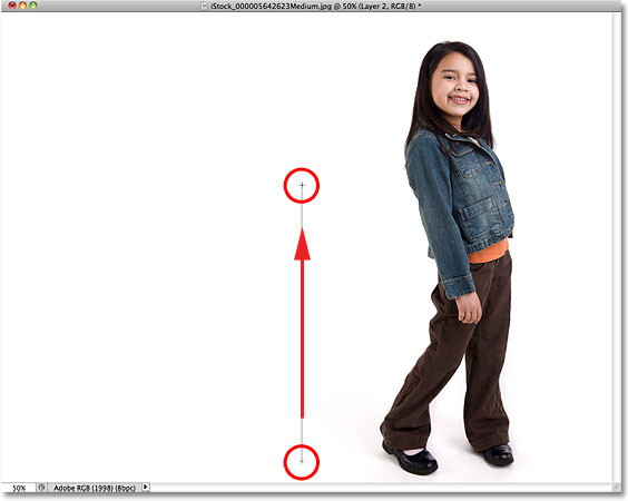
Then, click near the bottom of the document, hold down your Shift key and drag straight up until you're just above the horizontal center of the image. Holding the Shift key as you drag constrains your movements, making it easier to drag vertically:
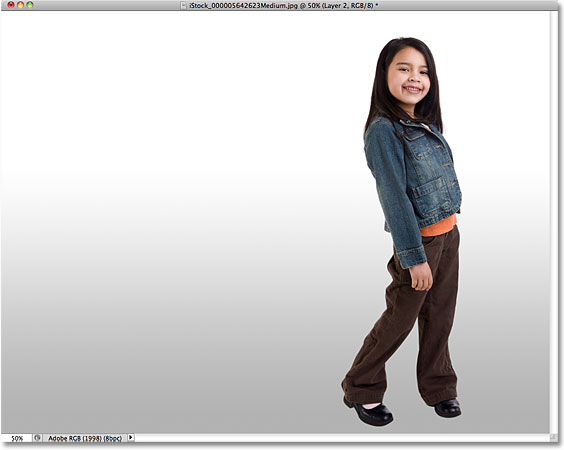
Release your mouse button and Photoshop draws the gradient, which becomes the new background for the image:
Step 6: Add A New Layer Above The Gradient
Click once again on the New Layer icon at the bottom of the Layers panel (no need to hold the Shift key down this time):
A new blank layer appears above the gradient layer:
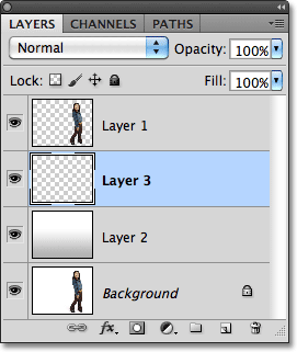
Step 7: Load A Selection Around The Person Or Object
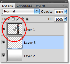
Hold down your Ctrl (Win) / Command (Mac) key and click directly on the top layer's preview thumbnail in the Layers panel. Don't select the layer, just click on its thumbnail:
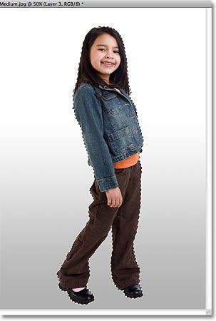
This instantly loads a selection around the contents of the layer. Here, we can see that the girl in my photo is now selected:
Step 8: Fill The Selection With Black
Go up to the Edit menu at the top of the screen and choose Fill:
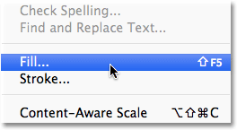
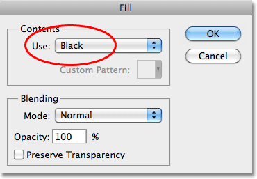
When the Fill dialog box appears, change the Use option at the top to Black, then click OK to close out of the dialog box:
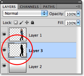
This fills the selection with black. We can't see it just yet in the document window because the image on Layer 1 is blocking it from view, but we can see it in the layer's preview thumbnail in the Layers panel:
Step 9: Distort The Shadow Into Position
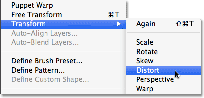
The area we just filled with black will become our shadow. First, we need to reshape it and move it into position, and we can do that using Photoshop's Distort command. Go up to the Edit menu, choose Transform, and then choose Distort:
Reshape the black-filled area by clicking on the top transform handle and dragging it down diagonally, either left or right (depending on your image), until it looks more like the person or object's shadow:
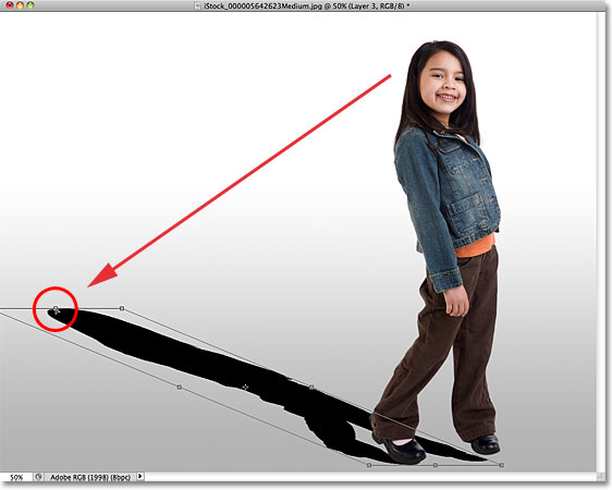
You may also need to fix the bottom part of the shadow by dragging the bottom corner handles. In my case, the bottom of the shadow didn't quite line up with the girl's shoes, so I dragged the bottom right transform handle up and to the right until everything looked good:
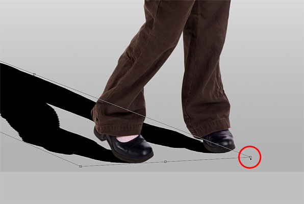
When you're done, press Enter (Win) / Return (Mac) to accept the transformation and exit out of the Distort command. Your shadow should now look something like this:
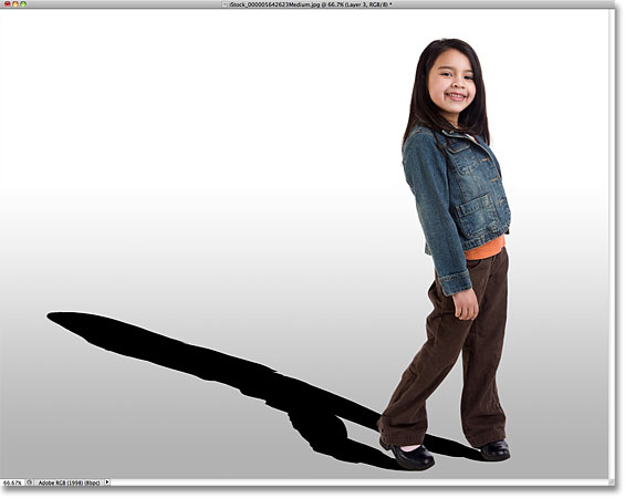
Step 10: Apply A Slight Blur
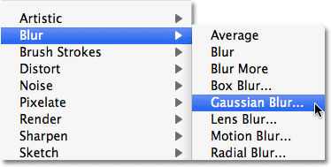
The edges of the shadow look a little too crisp and sharp, so let's apply a slight blur to it. Go up to the Filter menu, choose Blur, then choose Gaussian Blur:
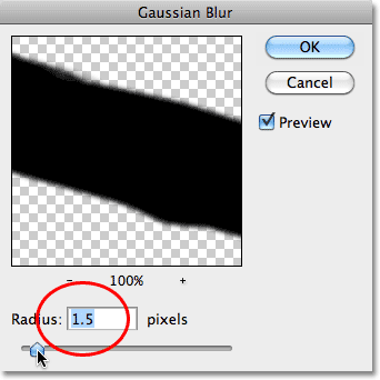
This opens the Gaussian Blur dialog box. Increase the Radius to around 1.5 pixels for a very subtle blur effect, then click OK to exit out of the dialog box. The edges of the shadow will appear softer:
Step 11: Use Quick Mask Mode To Gradually Select The Shadow
For a shadow to look realistic, the edges need to become gradually softer the further away it extends from the subject. To create this gradual blurring effect, we'll again turn to the Gaussian Blur filter, but first, we'll create a selection using Photoshop's Quick Mask mode.
Select the Gradient Tool once again from the Tools panel, then press the letter D on your keyboard to reset Photoshop's Foreground and Background colors to their defaults (black will be the Foreground color, white the Background color). Then, press the letter Q on your keyboard to switch into Quick Mask mode. Nothing will seem different in the document window just yet. With the Gradient Tool active, click near the bottom of the shadow and drag diagonally to the top, like so:
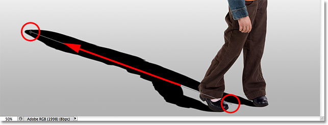
Release your mouse button at the top of the shadow, and a red to transparent Quick Mask overlay appears across the image. The transparent part at the top of the shadow represents the area that is fully selected. The red at the bottom of the shadow is not selected at all, while the area in between becomes more and more selected as the red color gradually fades into transparency:
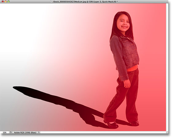
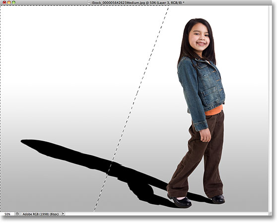
Press the letter Q on your keyboard to exit out of Quick Mask mode and back into normal mode. The red to transparent Quick Mask overlay will be replaced with a standard looking selection outline that seems to do nothing more than divide the shadow in half, with only the top half selected. This is just an unfortunate illusion on Photoshop's part. Photoshop can only display selection outlines around pixels that are at least 50% selected. So while it looks like we haven't really accomplished anything here, that Gaussian Blur filter is about to prove otherwise:
Step 12: Apply The Gaussian Blur Filter Again
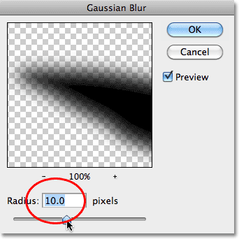
Since the Gaussian Blur filter was the last filter we used, we can quickly bring it back up by pressing Ctrl+Alt+F (Win) / Command+Option+F (Mac) on the keyboard. This time, when the dialog box appears, increase the Radius value to around 10 pixels, then click OK to exit out of it:
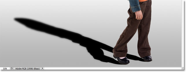
Press Ctrl+D (Win) / Command+D (Mac) to remove the selection outline, and we see in the document that the edges of the shadow now appear gradually softer from bottom to top:
Step 13: Add A Layer Mask
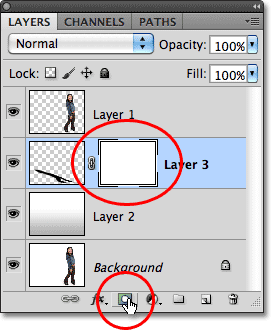
The shadow needs to fade out as it moves further from the subject, which is easy to do using a layer mask. Click on the Layer Mask icon at the bottom of the Layers panel. A white-filled layer mask thumbnail will appear to the right of the shadow layer's preview thumbnail:
Step 14: Set The Foreground Color To A Dark Gray
We don't want the shadow to fade out completely, so click on the Background color swatch in the Tools panel, which should currently be black (the default Foreground and Background colors are reversed when a layer mask is selected):

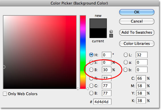
When the Color Picker appears, choose a dark gray by setting the B (Brightness) value to 30%. Leave the H (Hue) and S (Saturation) options set to 0%. Click OK when you're done to close out of the Color Picker:
Step 15: Draw A Gradient Across The Shadow On The Layer Mask
Then, with the Gradient Tool selected, click once again near the bottom of the shadow and drag diagonally upward to the top, just as we did a moment ago when in Quick Mask mode. The difference here is that we're drawing the gradient on the layer mask:
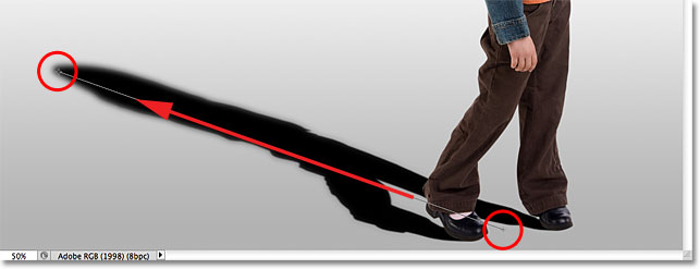
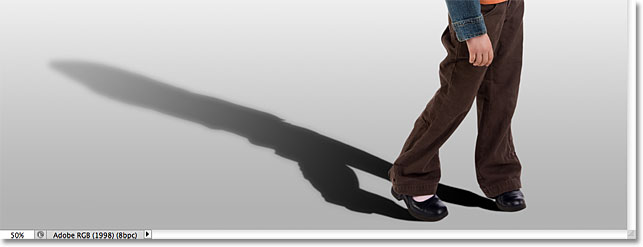
Release your mouse button at the top of the shadow. Since we drew the gradient on the layer mask, not on the image itself, we don't actually see the gradient in the document. Instead, we see the effect of the gradient on the layer mask, with the shadow now gradually fading as it moves away from the subject:
Step 16: Lower The Opacity Of The Shadow
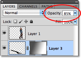
As a final step, let's lower the opacity of the shadow so it doesn't appear quite so dark near the subject (since shadows are always somewhat transparent). You'll find the Opacity option in the top right corner of the Layers panel. Lower it slightly to around 85%:
And with that, we're done! Here's the final "cast shadow" effect:
