
80s Retro Text Effect With Photoshop
In this tutorial, we'll learn how to create a fun 80's retro text effect in Photoshop, with shiny chrome and neon letters! To create the effect, we'll use Photoshop's layer styles, which will not only make things easy but will also keep our text fully editable. We'll use a Gradient fill layer to create a background for the effect. And to finish things off, we'll add a few sparkles around the text using Photoshop's Brush Tool!
Much of the retro effect will be done using gradients, and we'll be creating several custom gradients along the way. To save time in the future, we'll save each custom gradient as a new preset. That way, the next time you want to create the retro effect, you'll be able to quickly select the gradients you need from the presets rather than having to recreate them all from scratch.
I'll be using Photoshop CC here but everything we'll be doing is fully compatible with Photoshop CS6 and with earlier versions of Photoshop. I'll also be using a couple of retro-style fonts that I downloaded from Adobe Typekit, available with most Creative Cloud subscription plans. If you don't have access to Adobe Typekit, no worries. A quick Google search will find lots of free retro fonts you can use.
Here's what the 80s retro text effect will look like when we're done:

There's a lot of steps, but they're all super easy, so if you're ready, let's get started!
How To Create an 80s Retro Text Effect
Step 1: Create A New Photoshop Document
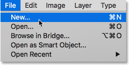
Let's begin by creating a new Photoshop document. Go up to the File menu in the Menu Bar along the top of the screen and choose New:
This opens the New Document dialog box. If you're using Photoshop CC, you'll see the newly-redesigned version of the dialog box. If you're using CS6 or earlier, you'll see the older, traditional dialog box. Let's look at the Photoshop CC version first, and then we'll look at the older version. Don't worry, this will only take a minute.
The redesigned version of the dialog box in Photoshop CC is made up mostly of a new area on the left where we can view and select thumbnails of preset document sizes for different types of projects (Photo, Print, Web, Mobile, etc.) as well as sizes that we've recently used. For this tutorial, you can ignore this new section. The only section we need is the Preset Details panel on the right where we find traditional options for creating our own custom document:
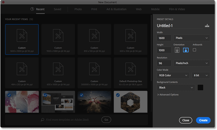
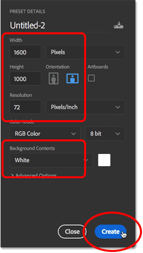
For this tutorial, we'll create a document with a Width of 1600 pixels and a Height of 1000 pixels. Set the Resolution value to 72 pixels/inch and the Background Contents to White. Then, click Create to create the new document:
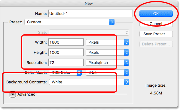
If you're using Photoshop CS6 or earlier, you'll see the older, traditional New Document dialog box. Again for this tutorial, set the Width to 1600 pixels and the Height to 1000 pixels. The Resolution value should be 72 pixel/inch and the Background Contents should be set to White. Click OK to create your new document:
Step 2: Add A Gradient Fill Layer
Before we add our text, let's create a more interesting background for the effect. To do that, we'll use one of Photoshop's Gradient fill layers. Click on the New Fill or Adjustment Layer icon at the bottom of the Layers panel:
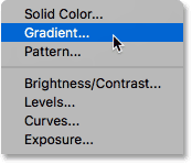
Then choose Gradient from the list:
Step 3: Create A New Custom Gradient
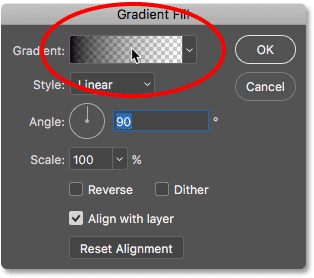
This opens the Gradient Fill dialog box. Click on the gradient color swatch at the top. My color swatch is currently showing the Black to Transparent gradient. Don't worry if yours is showing something different:
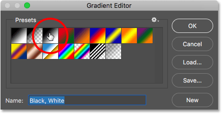
Clicking the color swatch opens Photoshop's Gradient Editor where we can create our own custom gradient. To give us a starting point, choose the Black, White gradient by clicking on its thumbnail (third one from the left, top row) in the Presets section at the top of the dialog box:
If we look in the bottom half of the Gradient Editor, we see a large preview bar showing us what the gradient currently looks like. Since we chose the Black, White gradient preset, the preview bar is showing a gradient running from black on the left to white on the right:
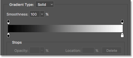
We can edit the colors of the gradient using the color stops directly below the preview bar. At the moment, there are two color stops; a black one on the left and a white one on the right.
Click on the black color stop on the left to select it. Then, click on the color swatch to change its color:
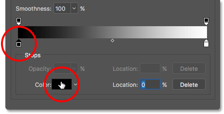
This opens Photoshop's Color Picker where we can choose a different color. For this first color, let's choose a dark blue by setting the R (Red) value to 0, the G (Green) value also to 0, and the B (Blue) value to 40:
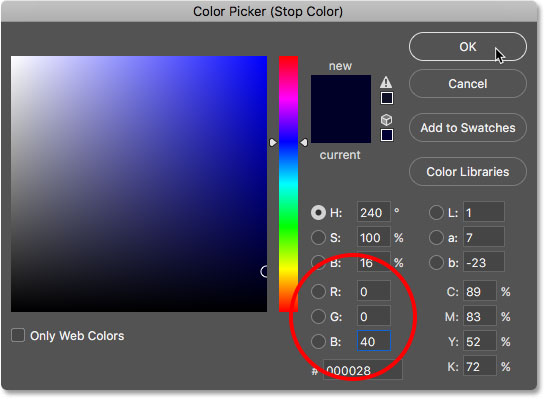
Click OK to close the Color Picker. Back in the Gradient Editor, click on the white color stop on the right to select it. Then, click the color swatch to change its color:
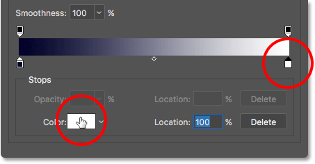
When the Color Picker opens, choose a dark pink by setting the R value to 25, G to 0 and B to 25:
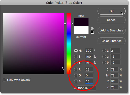
Click OK to close the Color Picker. We now have a gradient running from dark blue on the left to dark pink on the right. Let's add a third color in the middle of the gradient.
Click directly below the center of the preview bar to add a new color stop. Don't worry about clicking in the exact center because we'll set the location of the color stop after we've chosen a color. Once you've added the new color stop, click on the color swatch to change its color:
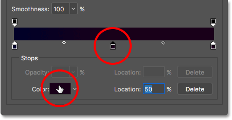
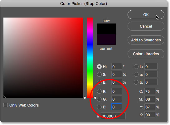
In the Color Picker, choose black for the middle of the gradient by setting the R, G and B values to 0:
Click OK to close the Color Picker. Then, in the Gradient Editor, make sure the new color stop is in the exact center of the gradient by setting its Location to 50%:

Step 4: Save The Gradient As A Preset
Before we close the Gradient Editor, let's save our custom gradient as a new preset. In fact, we'll save all of our custom gradients as presets as we go. That way, the next time you want to create this effect, you'll be able to quickly select the gradients from the Presets area rather than needing to create them again from scratch.
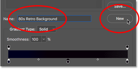
Enter a name for the gradient in the Name field directly below the Presets thumbnails. I'll name the gradient "80s Retro Background". Then, click the New button:
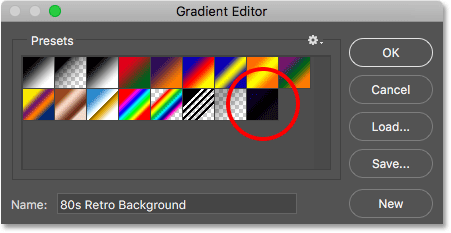
Photoshop saves the gradient as a new preset, and a thumbnail for it appears in the Presets area. You can now click the thumbnail to instantly select the gradient the next time you need it:
Step 5: Set The Style And Angle Of The Gradient
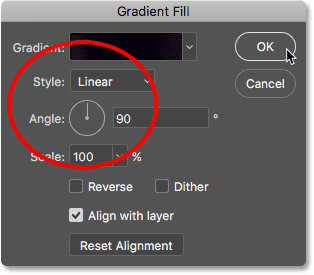
Click OK to close the Gradient Editor. Then, back in the Gradient Fill dialog box, make sure the Style option is set to Linear and the Angle is at 90°:
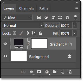
Click OK to close the Gradient Fill dialog box. If we look in the Layers panel, we see the new Gradient fill layer, named "Gradient Fill 1", sitting above the Background layer:
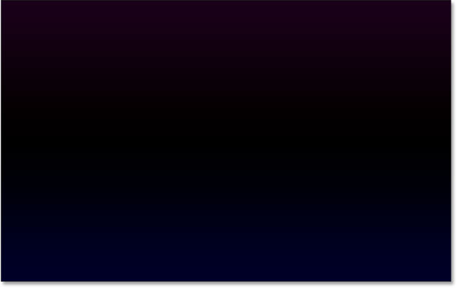
And in our document, even though it's a bit hard to see against the page's white background, we now have a gradient running from dark pink at the top to black in the middle and then to dark blue on the bottom. This will be the background for our retro text effect:
Step 6: Add Your Text
Now that we have our background in place, let's add some text. Select Photoshop's Type Tool from the Toolbar:

With the Type Tool selected, choose your font options in the Options Bar along the top of the screen. As I mentioned earlier, I'll be using a couple of fonts from Adobe Typekit, but you'll find lots of great (and free) retro fonts on Google.
In this case, I'll use a font called Orbitron Black. Once you've chosen your font, set the size to 72 pt. We'll resize the text manually once we've added it, but for now, this will let us start with the largest size we can choose from the list of preset sizes:

We'll set our type color to white so we can easily see it in front of the background. Click on the color swatch in the Options Bar:

This opens the Color Picker. Choose white by setting the R, G and B values to 255. Click OK to close the Color Picker when you're done:

Then, click inside the document and enter your text. I'll type the word "RETRO", all in caps:
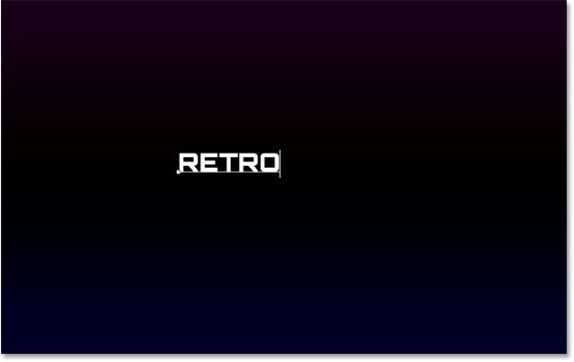
To accept the text, click the checkmark in the Options Bar:

Step 7: Resize And Reposition The Text With Free Transform
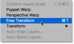
To resize and reposition the text, we'll use Photoshop's Free Transform command. Go up to the Edit menu at the top of the screen and choose Free Transform:
This places the Free Transform box and handles around the text. To resize it, drag any of the corner handles. Press and hold your Shift key as you drag the handles to lock the original shapes of the letters in place while you resize them. When you're happy with the size of the text, release your mouse button, then release your Shift key. Make sure you release your mouse button first, then the Shift key, or you'll get unexpected results:

To reposition the text, click anywhere inside the Free Transform box and drag the text into the center of the document:
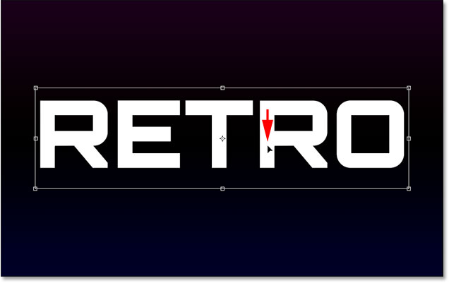
To accept the new size and position of the text, click the checkmark in the Options Bar:

Step 8: Add A Gradient Overlay Layer Style
If we look again in the Layers panel, we see our new Type layer sitting above the other layers. Let's create a chrome effect for the text. Click on the Layer Styles icon (the fx icon) at the bottom of the Layers panel:
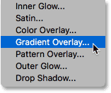
Choose Gradient Overlay from the list:
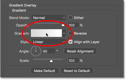
This opens Photoshop's Layer Style dialog box set to the Gradient Overlay options in the middle column. Click on the gradient color swatch:
Step 9: Create A New Custom Gradient
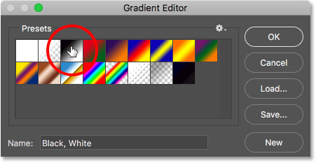
The Gradient Editor will open, just like it did earlier. Again, we're going to create our own custom gradient, but to give us a starting point, choose the Black, White gradient by clicking on its thumbnail (third from the left, top row) in the Presets area at the top:
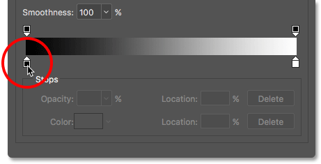
The Black, White gradient appears in the preview bar in the bottom half of the dialog box, with a black color stop below the left side of the bar and a white color stop below the right side.
We'll start by editing the color on the left. But rather than clicking on the color stop to select it and then clicking the color swatch to edit its color, let's use a faster shortcut. Double-click on the black color stop:
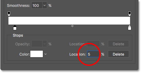
This selects the color stop and opens the Color Picker. Change the color from black to white by setting the R, G and B values to 255, then click OK:

Back in the Gradient Editor, change the Location of the color stop from 0% to 5%:
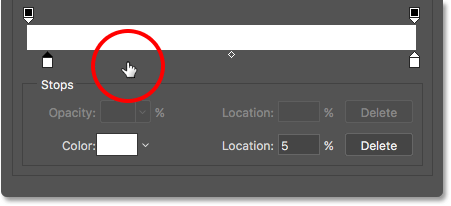
Next, add a new color stop by double-clicking to the right of the one we just edited. Don't worry about where you click because we'll set its location in a moment:
When the Color Picker opens, choose a medium, saturated pink by setting R to 220, G to 40 and B to 215. Click OK when you're done:
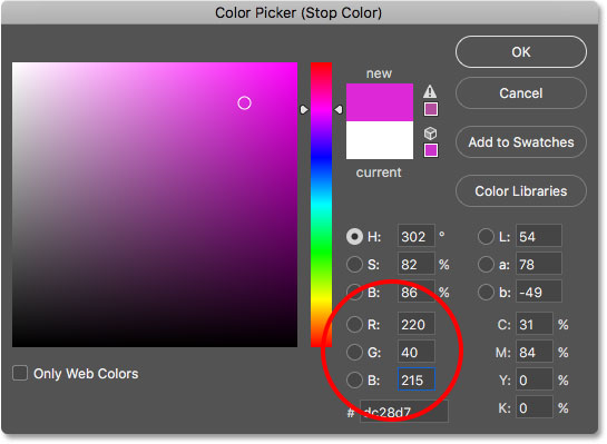
Set the Location of the new color stop to 25%:
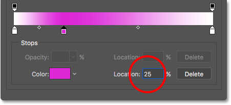
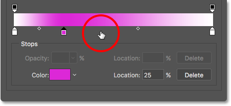
Double-click to the right of the previous color stop to add a new one:
In the Color Picker, choose black by setting R, G and B to 0. Click OK:
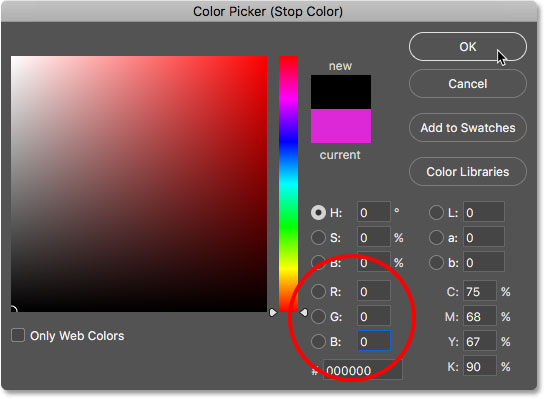
Set its Location to 50%:
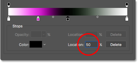
Double-click to add another color stop:
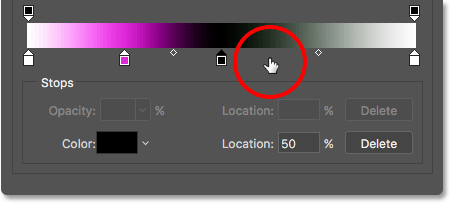
Choose white from the Color Picker by setting R, G and B to 255. Click OK:

Set the Location to 51% so it's sitting right up against the black color stop in the middle:
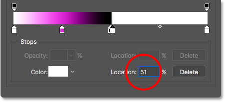
Add one more new color stop by double-clicking to the right of the previous one:
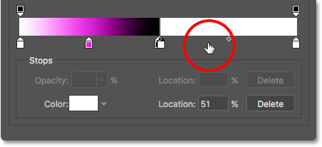
Choose a medium, saturated blue by setting R to 15, G to 95 and B to 215. Click OK:
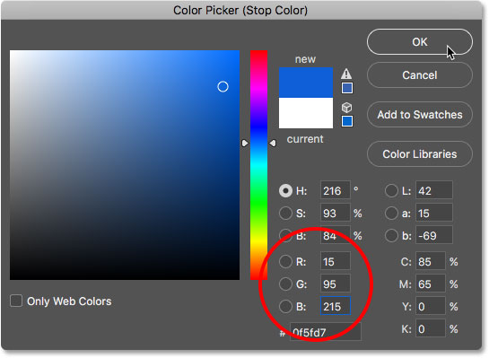
Set its Location to 75%:

Finally, let's edit the color stop on the far right by double-clicking on it:
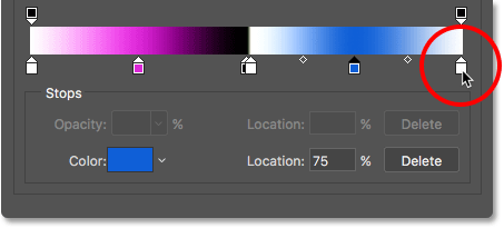
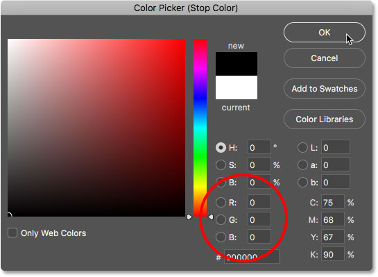
Change its color from white to black by setting R, G and B to 0, then click OK:
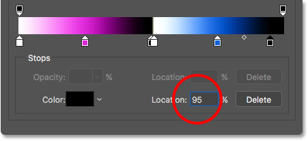
Then, change its Location from 100% to 95%:
Step 10: Save The Gradient As A Preset
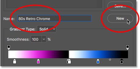
That was a lot of work, so before we close out of the Gradient Editor, let's save our custom gradient as another new preset. Enter a name for the preset in the Name field. I'll name mine "80s Retro Chrome". Click New to save it:
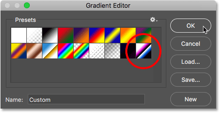
A new thumbnail for the preset appears in the Presets area. The next time you want to create this effect, you can quickly choose the gradient from the presets:
Step 11: Set The Style And Angle Of The Gradient
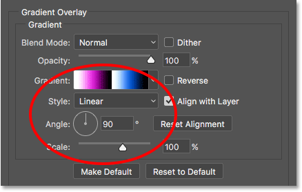
Click OK to close the Gradient Editor. Back in the Layer Style dialog box, make sure the Style of the gradient is set to Linear and the Angle is set to 90°:
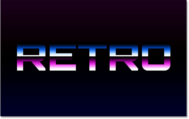
Leave the Layer Style dialog box open because we have a few more styles to add. Here's what my text looks like so far with the chrome gradient applied:
Step 12: Add A Stroke
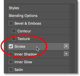
Next, we'll add a stroke around the letters. Click on the word Stroke in the left column of the Layer Style dialog box:
The Stroke options appear in the center of the dialog box. Change the color of the stroke by clicking the color swatch:
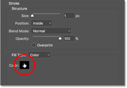
Change the stroke color to the same shade of blue we used for the chrome gradient by setting R to 15, G to 95 and B to 215. Click OK:

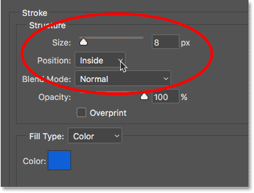
Once you've changed the color, set the Position of the stroke to Inside to give the stroke sharp corners. Then, increase the Size to adjust the thickness of the stroke. I'll set mine to 8 px:
Here's my text after adding the blue stroke:

Step 13: Add A Bevel & Emboss Style
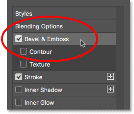
Still in the Layer Style dialog box, choose Bevel & Emboss from the column on the left:
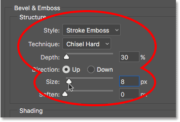
The opens the Bevel & Emboss options. In the Structure area at the top, increase the Size to the same value you used for the stroke. In my case, it was 8 px. Then, set the Style to Stroke Emboss and the Technique to Chisel Hard. Lower the Depth to 30%:
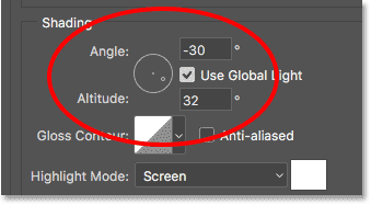
In the Shading section, set the Angle to -30° and the Altitude to 32°:
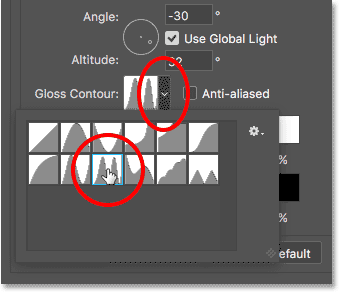
Then, click on the small arrow to the right of the Gloss Contour thumbnail. Don't click on the thumbnail itself, just the arrow beside the thumbnail. Choose the Ring - Double contour by double-clicking its thumbnail (third from the left, bottom row):
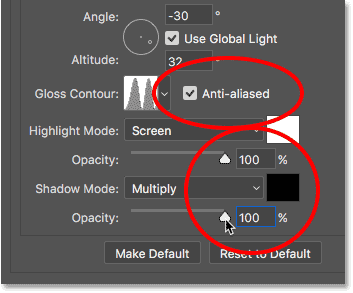
Turn on the Anti-aliased option to the right of Gloss Contour by clicking inside its checkbox. Then, increase the Opacity of both the Highlight Mode and the Shadow Mode to 100%:
Here's my text with Bevel & Emboss applied to the stroke:

Step 14: Turn On "Contour"
Turn on Contour by clicking inside its checkbox, directly below Bevel & Emboss in the left column of the dialog box:
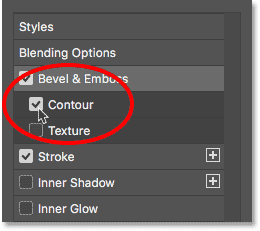
This enhances the lighting effect on the stroke, making the letters look shiny and metallic:

Step 15: Add An Inner Glow
Choose Inner Glow from the column on the left:
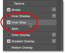
In the Inner Glow options, change the color of the glow by clicking the color swatch:

In the Color Picker, choose a darker blue by setting R to 15, G to 30 and B to 130. Click OK:

Back in the Inner Glow options, change the Blend Mode of the glow from Screen to Multiply, which switches it from being a glow to a shadow. Increase the Opacity to 100%. Then, increase the Size to around 18 px, so you can just barely see it around the inside of the letters:
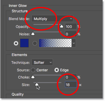
Here's my text with the Inner Glow applied. Since the screenshot is small, it's a bit tough to see, but with your effect, you should be able to see a very thin blue shadow around the inside of each letter:

Step 16: Add An Outer Glow
Choose Outer Glow from the column on the left:
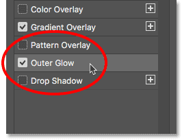
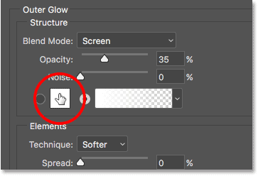
Change the color of the Outer Glow by clicking the color swatch:
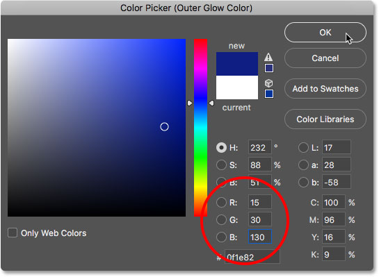
In the Color Picker, choose the same darker shade of blue that we chose for the Inner Glow by once again setting R to 15, G to 30 and B to 130. Click OK:
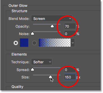
Back in the Outer Glow options, increase the Opacity to 70%, then increase the Size to 150 px:
At this point, we've added all of our layer styles to the text, so click OK to close out of the Layer Style dialog box. Here's my chrome text with the blue Outer Glow around the letters:

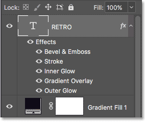
If we look in the Layers panel, we see our Type layer with all of our layer styles listed below it:
Step 17: Add More Text
Let's add more text to the design. With the Type Tool still selected, click below the word "RETRO" and type in a new word. I'll type "4ever". Click the checkmark in the Options Bar to accept the text:

Step 18: Change The Font
With the new word added, let's go up to the Options Bar and change the font. I'll choose another font I downloaded from Adobe Typekit, this one called BD Retrocentric. Again, if you don't have access to Adobe Typekit, there's lots of free retro fonts to choose from on Google:

The reason we didn't change the font before adding the second word is because we still had our original Type layer selected in the Layers panel, which means Photoshop would have changed the font for the word "RETRO", and that wasn't what we wanted. To keep the original font for the first word, we needed to add a second Type layer before changing the font.
Here's what the word "4ever" looks like with my new font. It's too small at the moment, but we'll fix that next:

Step 19: Resize The Text With Free Transform
Let's resize and reposition the new text by going up to the Edit menu and choosing Free Transform:

Press and hold your Shift key and drag the corners handles to resize the text. To reposition the text, click inside the Free Transform box and drag it into place. I'll resize and move my text so that it's sitting below the right side of the word "RETRO". Click the checkmark in the Options Bar when you're done to accept the changes:

Step 20: Add A Gradient Overlay Layer Style
Let's give this new word more of a neon look. Click on the Layer Styles (fx) icon at the bottom of the Layers panel:
Choose Gradient Overlay from the list:

In the Layer Style dialog box, click on the gradient color swatch to open the Gradient Editor:
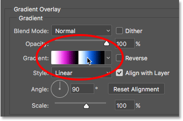
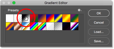
Choose the Black, White gradient from the Presets section by clicking on its thumbnail:
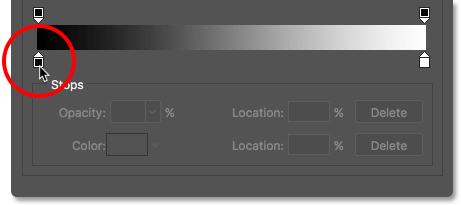
Double-click on the black color stop on the left to change its color:
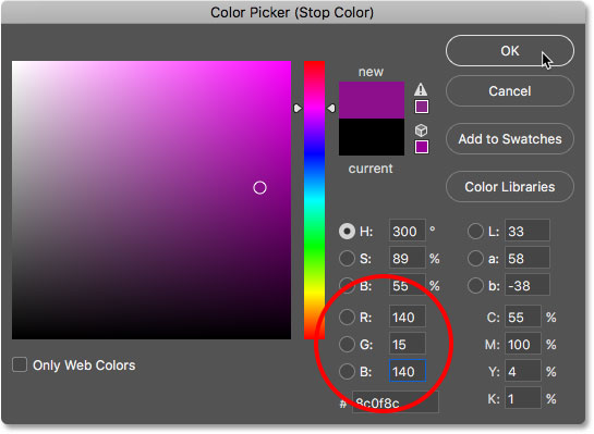
Choose a dark pink by setting R to 140, G to 15 and B to 140. Click OK:
Set the Location of the color stop to 25%:
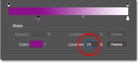
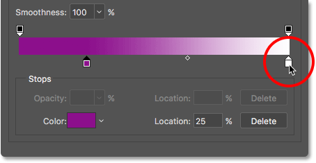
Double-click on the white color stop on the right to change its color:
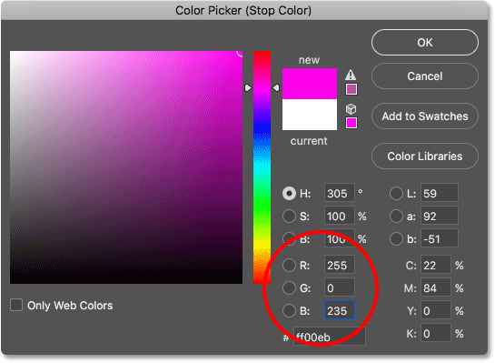
Choose a lighter pink by setting R to 255, G to 0 and B to 235. Click OK:
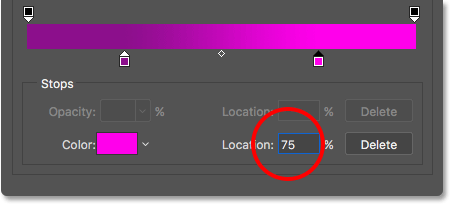
Change its Location to 75%:
Step 21: Save The Gradient As A Preset
Enter a name for the gradient. I'll name mine "80s Retro Neon". Then, click New to save it as a preset:
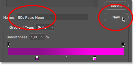
A thumbnail for the new preset appears, ready to be re-selected the next time you create the effect:
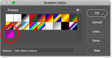
Step 22: Set The Style And Angle Options
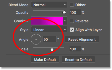
Click OK to close out of the Gradient Editor. Back in the Layer style dialog box, make sure the Style for the gradient is set to Linear and the Angle is at 90°:
Here's what the text (the word "4ever") looks like with the "80s Retro Neon" gradient applied:

Step 23: Add An Inner Glow Style
Choose Inner Glow from the column on the left:
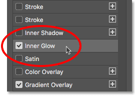
Click the color swatch to change the color of the glow:
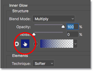
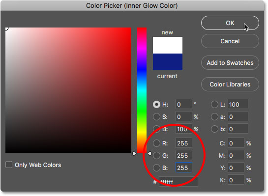
In the Color Picker, choose white by setting R, G and B to 255. Click OK:
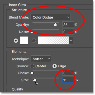
Change the Blend Mode of the Inner Glow to Color Dodge and the Opacity to 85%. Then, set the Size to around 11 px:
Here's my text with the gradient and the inner glow applied:

Step 24: Add A Bevel & Emboss Style
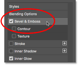
Choose Bevel & Emboss from the column on the left:
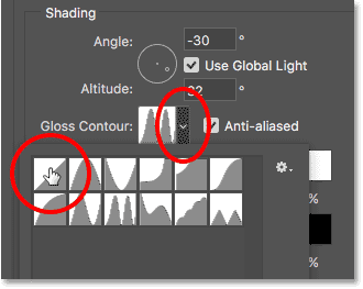
Down in the Shading options, click on the small arrow to the right of the Gloss Contour thumbnail and choose the Linear contour by double-clicking on its thumbnail (first one on the left, top row):
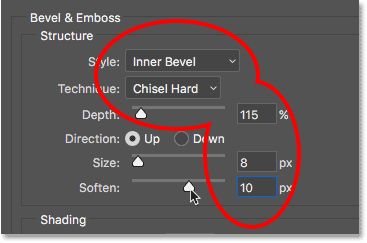
Then, up in the Structure options, change the Style to Inner Bevel and Technique to Chisel Hard. Set the Depth to around 115%, the Size to 8 px, then increase the Soften option to around 10 px to smooth out the edges:
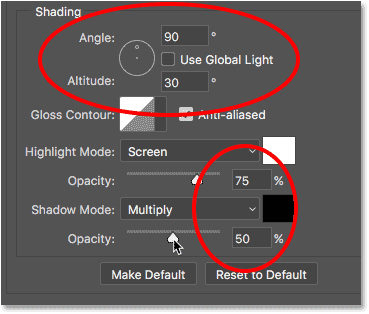
Back in the Shading section down at the bottom, uncheck Use Global Light and make sure Angle is set to 90° and Altitude is at 30°. Finally, set the Opacity of the Highlight Mode to 75% and the Shadow Mode to 50%:
Here's the word "4ever" after applying Bevel & Emboss. The letters now have a more rounded look to them:

Step 25: Add An Outer Glow
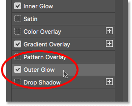
Just one more layer style to apply. Choose Outer Glow from the column on the left:
Click the color swatch to change the color of the Outer Glow:

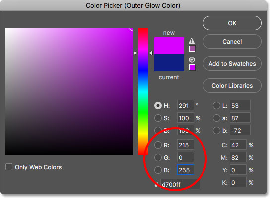
In the Color Picker, choose pink by setting R to 215, G to 0 and B to 255. Click OK:
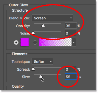
Make sure the Blend Mode is set to Screen. Set the Opacity to around 35%, and finally, increase the Size to around 55 px:
And with that, we're done with our layer styles! Click OK to close out of the Layer Style dialog box. Here's what my retro text effect now looks like:

Step 26: Make A Copy Of The Neon Text Layer
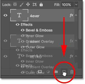
Let's add another neon word to the effect, this time above the word "RETRO". Click on the top Type layer in the Layers panel (in my case, it's the "4ever" layer) and drag it down onto the New Layer icon at the bottom of the Layers panel. A copy of it, complete with all the layer styles we added, will appear above the original:
Step 27: Select The Move Tool
Select Photoshop's Move Tool from the Toolbar:

Step 28: Drag The Copy Into Place
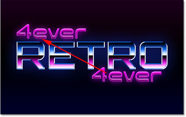
With the Move Tool selected, click on the copy of the "4ever" text in the document and drag it above the left side of the word "RETRO":
Step 29: Change The Word To "80s"
If you look in your Layers panel, you'll see a copy of the Type layer (with the word "copy" in its name) above the original. To edit the text, double-click on the Type layer's thumbnail:
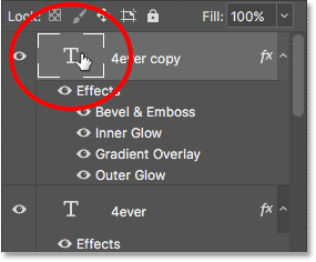
This highlights the existing text:

Enter "80s" for the new word. Click the checkmark in the Options Bar to accept it:

Step 30: Skew And Reposition The Text
Let's skew the text upwards to add more interest, and we'll reposition it as well. Go up to the Edit menu, choose Transform, then choose Skew:
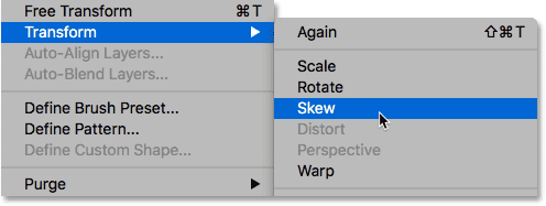
Photoshop places the Transform box and handles around the text. Click on the right handle and drag it upwards until you're happy with the angle of the text:

Then, click inside the Transform box and drag the text into place so that the bottom of "80s" overlaps the top of "RETRO":

Click the checkmark in the Options Bar to accept the changes:

And here's the retro text effect after skewing and moving the text. We're almost done:

Step 31: Add A New Blank Layer
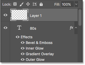
Let's finish up the effect by adding a few sparkles around the chrome "RETRO" letters. For that, we'll need a new layer. Click on the New Layer icon at the bottom of the Layers panel:
The new blank layer ("Layer 1") appears above the "80s" Type layer:
Step 32: Select The Brush Tool
Select Photoshop's Brush Tool from the Toolbar:

Step 33: Load The "Assorted Brushes" Set
The brush we need for the sparkles isn't found in Photoshop's default brushes so we'll need to load in one of the other brush sets that's included with Photoshop.
With the Brush Tool selected, right-click (Win) / Control-click (Mac) anywhere inside the image to open Photoshop's Brush Preset Picker. Then, click on the menu icon (the gear icon) in the upper right corner:
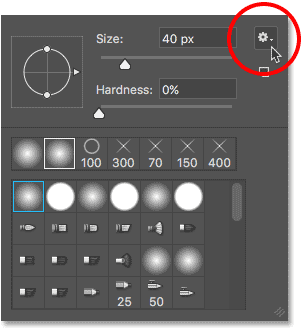
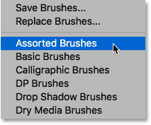
In the lower half of the menu, you'll see a list of other brush sets. Choose the Assorted Brushes set at the top of the list:
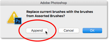
Photoshop will ask if you want to replace the current brushes with the new brushes. Click Append which will simply add the new ones in with the originals:
Step 34: Choose The "48 px Crosshatch 4" Brush
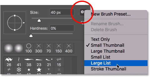
To make it easier for us to choose the brush we need, click again on the menu icon in the upper right of the Brush Preset Picker. Then, choose either Small List or Large List from the menu. I'll choose Large List. This lets us view the brushes as a list rather than as thumbnails:
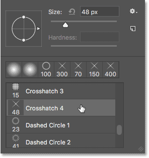
Scroll down the list until you find the 48 px Crosshatch 4 brush. Double-click on it to select it and close the Brush Preset Picker:
Step 35: Set Your Foreground Color To White
Make sure your brush color is set to white by pressing the letter D on your keyboard to quickly reset your Foreground and Background colors, which will make your Foreground color black and your Background color white. Then, press X to swap them, setting your Foreground color to white.
You can see your current Foreground and Background colors in the color swatches near the bottom of the Toolbar. Photoshop uses the Foreground color as the brush color, so make sure its swatch (upper left) is showing white:

Step 36: Change The Angle And Size Of The Brush
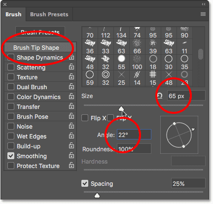
Before we add our sparkles, let's change the angle of the brush, again to add more interest. Press the F5 key on your keyboard. This is a quick way to open Photoshop's main Brush panel.
Make sure you have Brush Tip Shape selected at the top of the column on the left. Then, change the Angle to around 22°. Finally, increase the Size of the brush to around 65 px. You can experiment with the brush size if you like, but for this tutorial, 65 px should work nicely:
Step 37: Paint A Few Sparkles
To add the sparkles to the chrome, simply click in a few random spots around the word "RETRO". Three or four clicks should do it:
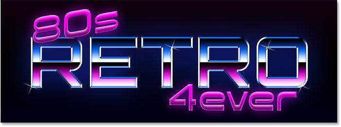
And with that, we're done! Here, after adding the sparkles, is my final 80s retro text effect:

And there we have it! That's how to create a fun, 80s retro text effect in Photoshop using layer styles and custom gradients! Visit our Text Effects section for more Photoshop text effects tutorials!