The Overlay Blend Mode In Photoshop
We've looked at the Multiply blend mode which darkens images, great for restoring shadows and fixing overexposed photos. We've looked at the Screen blend mode which lightens images, perfect for brightening highlights and fixing underexposed photos.
Next up in our look at the essential blend modes for photo editing in Photoshop is a blend mode that both multiplies dark areas and screens light areas at the same time, the Overlay mode.
As we saw at the very beginning of our discussion, the Overlay mode is part of the Contrast group of blend modes, along with other blend modes such as Soft Light, Hard Light, Vivid Light, Linear Light, and so on. Each of these blend modes is designed to boost the contrast in an image, but the Overlay mode is by far the most popular and often used, and one you most definitely need to know.
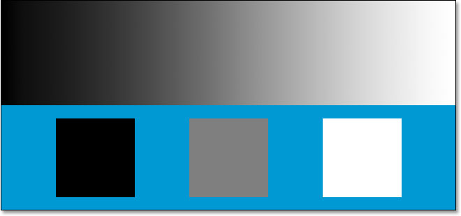
Let's use our simple two-layer document once again, this time to see how the Overlay mode works. Again, we have the Background layer filled with solid blue, and directly above it, we have a layer containing a horizontal black to white gradient along with a black square, a white square, and a square filled with 50% gray:

Of course, as we've said before, everything looks the way it does right now because the top layer, named "Gradient and Squares", is currently set to the Normal blend mode:

Just to quickly recap, we've seen that by changing the "Gradient and Squares" layer to the Multiply blend mode, everything became darker. The white areas disappeared from view, the black areas remained unchanged, and everything else blended in with the solid blue color on the Background layer to give us a darker result. When we set the layer to the Screen blend mode, everything became lighter. The black areas disappeared, the white areas remained unchanged, and everything else blended in with the solid blue color to give us a lighter result.
The Overlay blend mode both multiplies dark areas and screens light areas at the same time, so dark areas become darker and light areas become lighter. Anything on the layer that is 50% gray completely disappears from view. This has the effect of boosting image contrast, which is why one of its most common uses in photo editing is to quickly and easily improve contrast in badly faded images. Let's see what happens when I change the blend mode of the "Gradient and Squares" layer to Overlay:

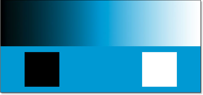
Based on what we just learned, with the "Gradient and Squares" layer set to Overlay, the 50% gray square, along with the area in the middle of the gradient directly between black and white, should completely disappear from view. Anything darker than 50% gray should become even darker, and anything lighter than 50% gray should become even lighter. Let's look at our document and see what's happened:

Sure enough, the 50% gray square, along with the area in the middle of the gradient, has disappeared, while everything left of center in the gradient has blended with the blue color underneath to become darker, while everything right of center in the gradient has blended with the blue color to become lighter.
What's strange here, though, is that you probably expected the black and white squares, along with the black and white areas of the gradient, to remain unchanged, with black remaining black and white remaining white, since I said that the Overlay mode multiplies the dark areas and screens the light areas. When we looked at the Multiply blend mode, the black areas remained black, and when we looked at the Screen blend mode, the white areas remained white. It would make sense then that anything black should still be black and anything white should still be white. Yet we can see in our document above that this is not the case. The black square and black area of the gradient on the left have actually lightened a little to become a dark blue, while the white square and white area of the gradient on the right have darkened a little to become a light blue. What's up with that?
What's up with that is a little thing called "favoritism". That's right, favoritism isn't something that only happens with your family or co-workers. It's also alive and well inside Photoshop. With the Overlay blend mode, Photoshop actually favors the underlying layer or layers, as opposed to the layer you've set to the Overlay mode. In other words, in our case here, Photoshop is giving less importance to the "Gradient and Squares" layer, which is the layer that's set to the Overlay mode, and more importance to the solid blue Background layer below it. That's why the blue color has "won out", so to speak, over the black and white colors we were expecting to see.
Watch what happens if I switch the order of the layers in the Layers palette so that the "Gradient and Squares" layer is on the bottom and the solid blue color is above it. Now, Photoshop doesn't actually allow us to move the Background layer, so I'll need to rename it first. To do that, I'll simply hold down my Alt (Win) / Option (Mac) key and double-click directly on the word Background in the Layers palette, which tells Photoshop to rename the layer to "Layer 0". Now that the layer is no longer named "Background", I'm free to move it. I'll go ahead and move "Layer 0", which is our solid blue layer, directly above the "Gradient and Squares" layer. I'm also going to reset the "Gradient and Squares" layer back to the Normal blend mode, and this time, I'll set the solid blue layer to Overlay:

This time, since it's the solid blue color that's set to Overlay, Photoshop is going to favor the "Gradient and Squares" layer underneath it. This should mean that the black and white areas on the "Gradient and Squares" layer should remain black and white. Let's see how it looks:

Sure enough, that's exactly what's happened. The black areas are still black and the white areas are still white, while the 50% gray areas are still hidden from view. The Overlay mode seems to have a much stronger effect now with a much more obvious boost in contrast, all because we switched the stacking order of the two layers. We're still using the exact same Overlay blend mode, but because we learned that Photoshop always favors the layer or layers below the layer that's set to Overlay, we were able to enhance the contrast effect even further.
In most cases, this whole "favoritism" thing with the Overlay mode won't be an issue, but it's still good to know.
Real World Example of the Overlay Blend Mode
Let's look at how easily the Overlay blend mode can be used to improve contrast in an image. Here we have another old photo, this one badly faded in both the highlights and shadows:

Just as I did when we looked at both the Multiply and Screen blend modes, I'm going to add a Levels adjustment layer above the image by clicking on the New Adjustment Layer icon at the bottom of the Layers palette and choosing Levels from the list:

Again, there's no need to make any changes inside the Levels dialog box, so when it appears, I'll simply click OK to exit out of it. Photoshop goes ahead and adds a Levels adjustment layer above the Background layer. As we know, by default, Photoshop sets all new layers to the Normal blend mode, so I'm going to change the blend mode of my Levels adjustment layer to Overlay:

And now if we look at the image, we can see that simply by adding that Levels adjustment layer and changing its blend mode to Overlay, we've already made a noticeable improvement to the contrast. The dark areas are now darker and the light areas are lighter:

I think we can improve the contrast even more, and we can do that simply by duplicating the adjustment layer, which I'll do by pressing Ctrl+J (Win) / Command+J (Mac). This gives me a duplicate of the Levels adjustment layer and, because my original adjustment layer was set to the Overlay blend mode, the duplicate is automatically set to Overlay as well:

And now if we look at the image again, we can see that the contrast has been increased even further. Actually, it's too strong at this point with that second adjustment layer. We're starting to lose some detail in the brightest and darkest areas:

To fine-tune the contrast, I can simply lower the Opacity of the duplicate adjustment layer. I'll lower it down to about 60%:

Here's the photo once again after lowering the opacity to reduce the amount of contrast:

And that's how easy it is to restore shadows and highlights in a photo and boost image contrast using nothing more than a Levels adjustment layer (or two) and the Overlay blend mode.
This brings us to the end of our look at the third essential blend mode for editing, retouching and restoring photos in Photoshop. Next up, we'll look at our fourth essential blend mode, one that has nothing to do with shadows, highlights or contrast - the Color blend mode! Or jump back to the main page to choose a different blend mode!