Boosting Contrast And Color With The Luminosity Mask In Photoshop
In this photo retouching tutorial, we'll learn how to boost the contrast and color saturation of an image in Photoshop using what's called a luminosity mask, a little-known trick for selecting pixels in an image based on their luminosity, or lightness, values. We'll see how to copy the luminosity mask to its own layer and combine it with one of Photoshop's layer blend modes to increase contrast, bring out the colors and give your photo more visual punch.
I'll be using Photoshop CS6 for this tutorial but any recent version of Photoshop will work.
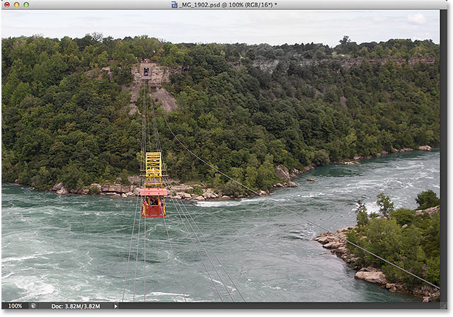
Here's the image I'll be starting with. At the moment, it's looking a little flat and dull:

Here's how it will look when we're done:

Let's get started!
Step 1: Load The Luminosity Mask As A Selection
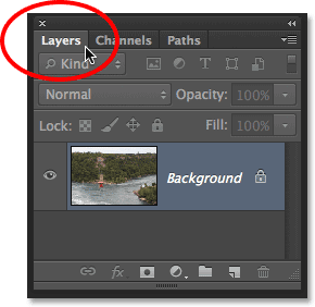
The first thing we need to do is switch over to Photoshop's Channels panel which you'll find grouped in beside the Layers panel. Click on its tab at the top to select and open it:

Since my image is using the RGB color mode, and yours most likely is as well, the Channels panel displays the Red, Green and Blue channels for the image, with each channel representing one of the three primary colors of light. It's also showing me what appears to be a fourth channel at the top named RGB, but this one isn't really a channel. It's the combination of the Red, Green and Blue channels below it, and it's what's giving us the full color image we see on the screen.
If all this talk of color channels is beyond your current Photoshop skill level (or your interest level), don't worry. You don't need to understand any of it for what we're doing here. All you need to know is that to select pixels based on their lightness values, simply press and hold the Ctrl (Win) / Command (Mac) key on your keyboard and click anywhere on the RGB channel at the top:

This loads a rather crazy looking selection inside your image. What's happened is that Photoshop has gone through the image and selected pixels based on how bright they are. Pixels that are pure white are selected 100%. Pixels that are pure black are not selected at all, and pixels that fall somewhere between white and black are partially selected based on how close they are to white:

Step 2: Copy The Selection To A New Layer
We're done with the Channels panel, so switch over to the Layers panel by clicking on its tab:

We need to copy our selection onto a new layer above the image, and we can do that by going up to the Layer menu at the top of the screen, choosing New, then choosing Layer via Copy. Or, you can press Ctrl+J (Win) / Command+J (Mac) on your keyboard to access the same command with the handy shortcut:

Photoshop copies the selected pixels onto a new layer named Layer 1 above the original image that's sitting on the Background layer:

To show you what I mean about pixels being only partially selected, click on the Background layer's visibility icon (the little eyeball icon) to temporarily hide the original image from view in the document window:
With the Background layer hidden, all we see in the document window is the contents of Layer 1. Notice that most of the pixels on the layer appear semi-transparent, and that's because they were only partially selected:

Click once again on the Background layer's visibility icon to bring the original image back into view:
Step 3: Change The Blend Mode To "Overlay"
Now that I have the brightest parts of my image on a separate layer, I'll use them to boost the color and contrast of my image. To do that, all I need to do is change the blend mode of Layer 1 from its default mode of Normal to Overlay. The Blend Mode option is found in the upper left of the Layers panel:

The Overlay blend mode is part of the Contrast group of blend modes in Photoshop, and its purpose is to boost image contrast by making dark areas darker and light areas lighter. If you find that the Overlay blend mode is too intense with your image, try the Soft Light blend mode instead. Soft Light also boosts contrast but with more subtle results:

I'm going to stick with the Overlay blend mode for my image. Here's what it now looks like. Notice that not only has the contrast been increased, but so has the overall color saturation:

Related Reading: Five Essential Blend Modes For Photo Editing
Step 4: Duplicate Layer 1 If Needed To Enhance The Effect Even More
If you need to increase the contrast and color saturation in your image even further, you can easily do so simply by duplicating Layer 1. To do that, make sure Layer 1 is selected and highlighted in the Layers panel, then go back up to the Layer menu at the top of the screen, choose New, then choose Layer via Copy. Or, press Ctrl+J (Win) / Command+J (Mac) for the keyboard shortcut:

Photoshop creates a copy of Layer 1, gives the copy the descriptive name Layer 1 copy, and places it directly above the original. Notice that this copy of the layer is automatically set to the Overlay blend mode as well (or Soft Light if that's what you were using):

With two layers now combining to boost contrast and color saturation, the result is even stronger:

At this point, you may find that the contrast is now too strong. If that's the case, you can reduce and fine-tune it by lowering the new layer's opacity value. You'll find the Opacity option directly across from the Blend Mode option at the top of the Layers panel. I'll lower mine down to 50%:

And now the contrast and color saturation are a little less intense:

Step 5: Group The Top Layers
My image is now looking a lot better than it did when I started, but there's a small problem. By increasing the contrast, I've lost all the detail in the sky along the top of the photo. In fact, the sky now looks almost pure white. I could just leave it like that since the sky isn't the main focus of the photo anyway, but let's see how to easily bring the sky detail back using a layer mask.
In my case here, I have two layers that are boosting the contrast and color saturation of my image - the original luminosity selection on Layer 1 and the copy of Layer 1 above it - so the first thing I'll do is place both of these inside a single layer group. To do that, with my top layer (Layer 1 copy) already selected and highlighted in the Layers panel, I'll press and hold the Shift key on my keyboard and click on the original Layer 1 below it. This selects both layers at once (both appear highlighted):

With both layers selected, I'll click on the small menu icon in the top right corner of the Layers panel:
Then I'll choose New Group from Layers from the menu that appears:

Photoshop will pop open the New Group from Layers dialog box, giving us a chance to name the layer group. I'll name mine "Contrast". Click OK when you're done to close out of the dialog box:

And now if we look in the Layers panel, we see that both layers are now inside my "Contrast" layer group. You can click the small triangle to the left of the group's folder icon to twirl the group open and closed, showing or hiding the layers inside it:

Related Reading: Photoshop Layer Groups
Step 6: Add A Layer Mask To The Group
Now that both layers are inside the group, I'll add a layer mask to the group by clicking on the Add Layer Mask icon at the bottom of the Layers panel:

A white-filled layer mask thumbnail will appear on the layer group, letting us know the mask has been added:
Step 7: Paint With Black On The Layer Mask To Reveal The Original Image
With my layer mask added, I'll grab Photoshop's Brush Tool from the Tools panel along the left of the screen, or I could select it by pressing the letter B on my keyboard:

I'll need to paint on the layer mask with black to reveal the original photo in the areas I paint over, and Photoshop uses the current Foreground color as the paint color, so I'll press the letter D on my keyboard which will instantly reset my Foreground and Background colors to their defaults, making the Foreground color white and the Background color black. That's actually the opposite of what I need, so I'll press the letter X on my keyboard to swap them so the Foreground color becomes black.
We can see the current Foreground and Background colors in the color swatches near the bottom of the Tools panel. The Foreground color is the upper left swatch and should now be set to black:

With my Brush Tool selected and my Foreground color set to black, I'll simply paint over the sky along the top of my image to reveal the original photo hiding underneath the layer group. You can change the size of your brush as you're painting from the keyboard. Press the left bracket key ( [ ) repeatedly to make the brush smaller, or the right bracket key ( ] ) to make it larger. To control the hardness of the edge of the brush, press and hold your Shift key, then press either the left bracket key ( [ ) to soften the edges or the right bracket key ( ] ) to make them harder.
Here, I'm using a fairly small, soft-edge brush to paint over the sky. Notice the detail from the original image underneath showing through the areas I paint over:

Related Reading: Understanding Layer Masks In Photoshop
Once you've brought back any lost details in the image, you're done! Here's my original once again for comparison:

And here's my final result:

And there we have it! That's how to quickly boost the contrast and color saturation of an image using the luminosity mask and a layer blend mode in Photoshop! Check out our Photo Retouching section for more Photoshop image editing tutorials!