
Add Visual Interest To Your Photos With The Rule Of Thirds
In this Photoshop tutorial, we're going to look at how to add more visual interest to our photos by cropping them using a simple, tried and true design trick known as the Rule of Thirds. Don't worry, no prior design knowledge is necessary. The great thing about it is, not only is it something that any photographer can benefit from, amateur or professional, but once you've been introduced to it as we're about to do here, your photos will forever look better.
One of the tell-tale signs of an amateur photo or "tourist snapshot" is that the subject of the photo is smack dab in the center of the frame, as if the photographer was aiming at his or her subject not through the lens of a camera but through the scope of a rifle. An easy way to add more interest to your photos and make them look more professional is to position your subjects using what's known as the Rule of Thirds. If you've never heard of the Rule of Thirds, it's quite simple. For every three photos you take, you throw away the first two and keep only the third one, because the third one always looks the best.
Still reading? Good, because I'm joking. Hopefully you haven't deleted too many photos yet. The real idea behind the Rule of Thirds is to imagine that your photo is divided up into a grid of three equal rows and three equal columns, and the "rule" (think of it more as a guideline than a rule) is that your photo will look more interesting to people if the subject in the photo is positioned at one of the four points where these grid lines intersect. It's a very basic idea, and yet it works remarkably well, as we're about to see.
Things To Consider...
A couple of things to keep in mind though before we continue. First, it helps a lot if you already had the Rule of Thirds in mind when you took the photo, since then we'd have a better chance of being able to position the subject into one of these imaginary intersecting grid points. If the subject is taking up too much space in the image, there may not be enough room left around the subject to move it to a different position if it wasn't planned out ahead of time.
Also, since we're going to be cropping the images, we'll be creating smaller versions than the originals. The number of pixels in your image, which is determined by the megapixel (MP) value of your camera, will determine the maximum size you'll be able to crop to, but it will always be smaller than what we started out with.
For this tutorial, I'm going to take one of my photos, captured using an 8MP camera, and crop it down to a standard size 4x6 using the Rule of Thirds to make it more interesting. Keeping with standard photo sizes, I could probably go as large as a 5x7 with my 8MP images, but unless I had already positioned the subject close to one of those imaginary intersecting grid points when I snapped the photo, which in this case I didn't, it's doubtful that I would have enough wiggle room left in the image to crop to an 8x10, at least not without sacrificing image quality.
Okay, that's enough talking. Let's get things started. Here's the photo I'm going to be using in this tutorial:

As it is, it's not a bad photo. After all, it's hard to take a bad photo of a butterfly resting on a flower. However, it does sort of have that "I'm about to shoot you with my sniper rifle" look to it, and I think I could make this photo more interesting if I reposition the butterfly using the Rule of Thirds.
Before we go any further, let's see exactly what we mean by this Rule of Thirds.
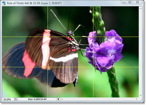
Here's the same photo again, but this time, I've added the grid lines that I've been talking about. They're the horizontal and vertical yellow lines dividing the image up into 3 equally sized rows and columns:

The points where these grid lines intersect have been circled in red. According to the rule of thirds, our image will look more interesting if the subject, which in this case is the butterfly, is positioned at or near one of these points, which at the moment it isn't. We're going to fix that.
As I stated on the previous page, since we're cropping images here, we'll be making smaller versions than the originals, and in this case, I want to turn my photo into a more interesting 4x6. Since I know exactly what size I want my final photo to be, the easiest thing to do is to create a new document at exactly that size. I'll assume from this moment on that you also want a 4x6, but if you're after a different size, any time you see me type "4x6", simply replace it with your own photo dimensions.
Step 1: Create A New 4x6 Document In Photoshop
Since I know I'm going to want a 4x6 when I'm done, I'm going to create a new blank 4x6 document in Photoshop by going up to the File Menu at the top of the screen and choosing New..., which brings up the New Document dialog box.
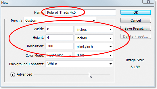
I want my photo to use landscape orientation, meaning the width is longer than the height, so I'll enter 6 inches for the width and 4 inches for the height. I also want to make sure my photo prints nice and sharp, so I'll enter 300 pixels per inch for the resolution value. I've also named my document "Rule of Thirds 4x6", but you don't have to name yours if you don't want to. When you're done entering the values, click OK and Photoshop will create your new blank document for you.
Step 2: Drag The Photo Into The New Document
Now that I have both my original photo and the new document open on my screen, I'm going to grab my Move tool either from the Tools palette or by pressing "M" on my keyboard, and then I'm going to click anywhere inside my photo and drag it with my mouse into the new document:
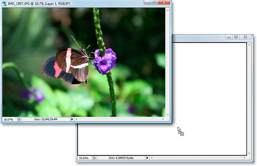
And here's what my new document now looks like after I dragged my photo into it. Since my original photo was considerably larger than a 4x6, the sides of the photo extend out beyond the dimensions of the document, but that's fine for now. All we need for the moment is for the photo to be inside the 4x6 document:

I don't need to have my original photo open anymore, and you don't either, so go ahead and close it, leaving only the new document open.
Before we go moving or resizing our photo inside the new document, we need our Rule of Thirds grid lines. Creating the grid lines in Photoshop is incredibly easy, but it's also a little time consuming and even worse, boring, and Easy + Time Consuming + Boring has "Create an action!" written all over it, which is what we're going to do next.
Before we go any further, let's see exactly what we mean by this Rule of Thirds.
Here's the same photo again, but this time, I've added the grid lines that I've been talking about. They're the horizontal and vertical yellow lines dividing the image up into 3 equally sized rows and columns:

The points where these grid lines intersect have been circled in red. According to the rule of thirds, our image will look more interesting if the subject, which in this case is the butterfly, is positioned at or near one of these points, which at the moment it isn't. We're going to fix that.
As I stated on the previous page, since we're cropping images here, we'll be making smaller versions than the originals, and in this case, I want to turn my photo into a more interesting 4x6. Since I know exactly what size I want my final photo to be, the easiest thing to do is to create a new document at exactly that size. I'll assume from this moment on that you also want a 4x6, but if you're after a different size, any time you see me type "4x6", simply replace it with your own photo dimensions.
Step 1: Create A New 4x6 Document In Photoshop
Since I know I'm going to want a 4x6 when I'm done, I'm going to create a new blank 4x6 document in Photoshop by going up to the File Menu at the top of the screen and choosing New..., which brings up the New Document dialog box.

I want my photo to use landscape orientation, meaning the width is longer than the height, so I'll enter 6 inches for the width and 4 inches for the height. I also want to make sure my photo prints nice and sharp, so I'll enter 300 pixels per inch for the resolution value. I've also named my document "Rule of Thirds 4x6", but you don't have to name yours if you don't want to. When you're done entering the values, click OK and Photoshop will create your new blank document for you.
Step 2: Drag The Photo Into The New Document
Now that I have both my original photo and the new document open on my screen, I'm going to grab my Move tool either from the Tools palette or by pressing "M" on my keyboard, and then I'm going to click anywhere inside my photo and drag it with my mouse into the new document:

And here's what my new document now looks like after I dragged my photo into it. Since my original photo was considerably larger than a 4x6, the sides of the photo extend out beyond the dimensions of the document, but that's fine for now. All we need for the moment is for the photo to be inside the 4x6 document:

I don't need to have my original photo open anymore, and you don't either, so go ahead and close it, leaving only the new document open.
Before we go moving or resizing our photo inside the new document, we need our Rule of Thirds grid lines. Creating the grid lines in Photoshop is incredibly easy, but it's also a little time consuming and even worse, boring, and Easy + Time Consuming + Boring has "Create an action!" written all over it, which is what we're going to do next.
In this section of the tutorial, we're going to not only create our rule of thirds grid lines, we're going to record an action as we're creating them so we only have to do this once.
Once we have the process saved as an action, the next time we go to crop an image using the Rule of Thirds, we can sit back and let Photoshop make the grid lines for us. Of course, you don't technically have to create an action for this if you're the type of person who has a thing for repetitive tasks, in which case you and I have nothing in common. I'm making an action.
Step 3: Create A New Action In The Actions Palette
Go to your Actions palette (it's grouped in by default with the History palette) and click on the Create New Action icon at the bottom of the palette, as shown below:
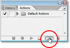
This brings up Photoshop's "New Action" dialog box:
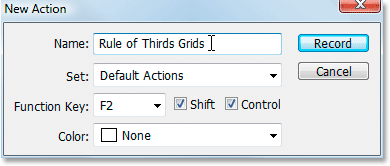
Name your new action "Rule of Thirds Grids" or something similar of your choosing. I'm creating my action in the Default Actions set, but feel free to create a new set or use an actions set you've previously created. To be able to access this action quickly with a keyboard shortcut, I've chosen the F2 key from the drop-down list of Function Key choices, along with Shift and Control, which means that once I've recorded my action, I'll be able to access it by pressing Shift+Ctrl+F2 (the Ctrl key would be the Command key if I was using a Mac). I've left the Color option set to "None". When you're done, click the Record button and let's begin creating these grid lines while Photoshop patiently and dutifully records each and every step along the way.
Step 4: Add A New Horizontal Guide
With Photoshop recording our steps, go up to the View menu at the top of the screen and choose New Guide..., which will bring up the New Guide dialog box. We're going to add our first of four guides which will become our Rule of Thirds grid.
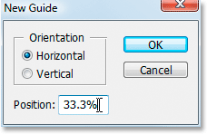
For "Orientation", select Horizontal, and in the "Position" value box, type in 33.3%, then click OK. You'll see your first guide appear over top of your photo:

Your guide probably won't show up in yellow. By default, guides are drawn in cyan. I've changed mine to yellow to make them easier to see. You can change the color of your guides as well by going to Photoshop's Preferences and then to the Guides, Grids & Slices preferences. The option to change the guide color is at the very top.
Step 5: Add A Second Horizontal Guide
Let's add a second horizontal guide. Again go back to the View menu and again choose New Guide..., to bring up the New Guide dialog box. Choose Horizontal again for "Orientation", and this time, type 66.6% for the "Position" value:
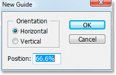
Click OK, and the second guide appears over the photo:

Step 6: Add A New Vertical Guide
Go back to the View menu once again and again choose New Guide... (see how this is becoming time consuming and boring?). This time choose Vertical for "Orientation", and type 33.3% for the "Position" value:
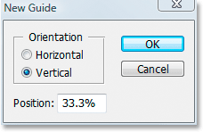
Click OK, and we now have three guides over our image. We're almost there:

Step 7: Add A Second Vertical Guide
Still awake? Good, because we have just one more to add. One last time, go up to the View menu, choose New Guide..., select Vertical for "Orientation", and finally, type 66.6% for the "Position" value:
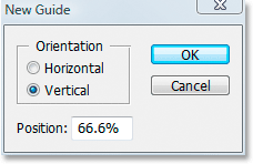
Click OK, and we're done! We now have our Rule of Thirds grid thanks to our four guides:
Step 8: Press 'Stop' To Finish Recording The Action
Now that we have our Rule of Thirds grid, we can stop recording the action. Click the Stop icon at the bottom of the Actions palette to complete our "Rule of Thirds Grids" action:
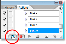
Now that we've saved the grid creation process as an action, the next time we need it, we can simply select the action from the Actions palette or use whichever keyboard shortcut you assigned for it We won't have to do this manually again.
And now that our Rule of Thirds grid is in place, we can finally use it to crop and move our image into position, which we'll do next.
We've created a new 4x6 Photoshop document. We've dragged our original photo into this new document. We've added two horizontal and two vertical guides to create our rule of thirds grid and saved the process as an action. All that's left to do now is move the subject of the photo into one of the four intersecting grid points.
After careful consideration, I've decided that my photo would look best with the butterfly positioned in or close to the top right intersection point, shown below circled in red:
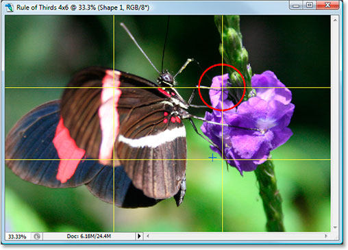
I'm going to move it into place and shrink the photo down in size at the same time using Photoshop's "Free Transform" option.
Step 9: Select The 'Free Transform' Option
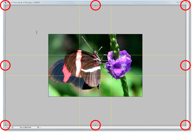
Use the keyboard shortcut Ctrl+T (Win) / Command+T (Mac) to quickly bring up the Free Transform box and handles around your image. When you do that, if it looks like nothing has happened, it's because your photo is larger than the document you've dragged it into and the sides of the image are extending out beyond the document window where you can't see them. We'll fix that problem in the next step.
Step 10: Press 'Ctrl+0' (Win) / 'Command+0' (Mac) To Fit Everything On Screen
Press Ctrl+0 (Win) / Command+0 (Mac) to fit your entire photo, including everything that's extending out beyond the boundaries of the document window, onto the screen, at which point the Free Transform box and handles will also be visible. I've circled the Free Transform handles in red below, since they're a bit hard to see in the screenshot:
Step 11: Move The Subject Of The Photo Into Position
With my Free Transform box around my image, the first thing I'm going to do is move the subject of my photo, the butterfly, into place. I want him (or her) to appear somewhere in that top right grid intersection point, so I'm going to click anywhere inside my photo and drag the butterfly into position. I think the spot where its front legs and body meet works nicely:
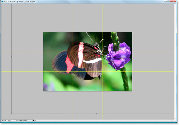
Step 12: Drag The Center Anchor Point Of The Free Transform Box To The Grid Point
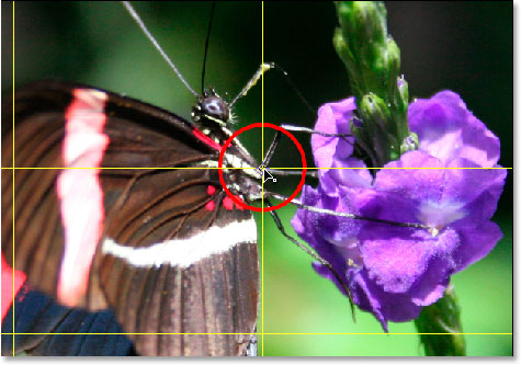
My subject is in place, but there's still quite a bit of the original photo that's still extending out of view, and I want to keep as much of it as I can in this new version of the image, so I'm going to drag the corner handles of the Free Transform box inward to fit more of the photo into the visible document area. Problem is, as I drag the handles inward, my butterfly is going to keep moving out of position on me, and I've already got it where I want it. Fortunately, I can avoid that problem by first moving the center anchor point of the Free Transform box to that top right grid point. That way, my butterfly will stay in place as I'm dragging.
You'll find the center anchor point, yep, you guessed it, in the center of the Free Transform box (circled in red below):
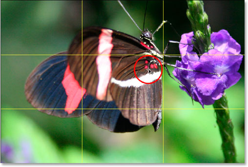
To move it, simply click it and drag it to a new location. I'm going to drag it to that top right grid point:
Step 13: Drag The Free Transform Handles Inward To Fit More Of The Original Photo Into The Image
Now that the center anchor point has been moved into place, it's time to finish things off by dragging any one of the Free Transform corner handle points inward, shrinking the size of the original photo thereby allowing more of it to fit into the new Rule of Thirds version of the image.
As you drag any of the corner handles inward, hold down Shift+Alt (Win) / Shift+Option (Mac) as you drag. The Shift key will constrain the proportions of the image, and the Alt or Option key will cause the image to shrink inward from the location of that center anchor point, which is exactly what we want. I'm going to hold down Shift+Alt, since I'm using a PC here, and I'll drag the bottom left corner point inward to fit as much of my original photo into my new 4x6 image as I can:
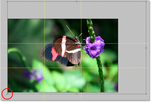
Press Enter or Return to apply the transformation.
Step 14: Hide The Guides And You're Done!
Press Ctrl+; (Win) / Command+; (Mac) to hide the guides we created, and remember that the next time you need to create that 3x3 Rule of Thirds grid, you have that action ready to go!
Once you've hidden the guides, that's it! You're done! Here's my original "sniper rifle" image for the sake of comparison:

And here's my more interesting looking "Rule of Thirds" 4x6 version, a subtle yet definite improvement:

And there we have it! Even if you're not a professional photographer and the only time you snap photos is on family vacations, you can use Photoshop and the Rule of Thirds design trick to easily make ordinary photos seem a little more extraordinary. Check out our Photo Retouching section for more Photoshop image editing tutorials!